This project involved designing a book that explores the intersection of typography and a chosen subject, using visual narrative and layout to educate an audience. The final printed book applies typographic systems, expressive type treatments, and informational diagrams to communicate the topic effectively.
How does typography shape cultural perceptions, and how can designers challenge stereotypes in typefaces to create more authentic and inclusive representations of cultural identities?
Research, Writing, Layout, Publication Design, Book Binding
Tools: Google Docs, Adobe InDesign, Illustrator, Book Clamp (Binding)
Members: Angela Garcia
Timeline: 6 weeks
────────────
────────────
Research & Writing Process
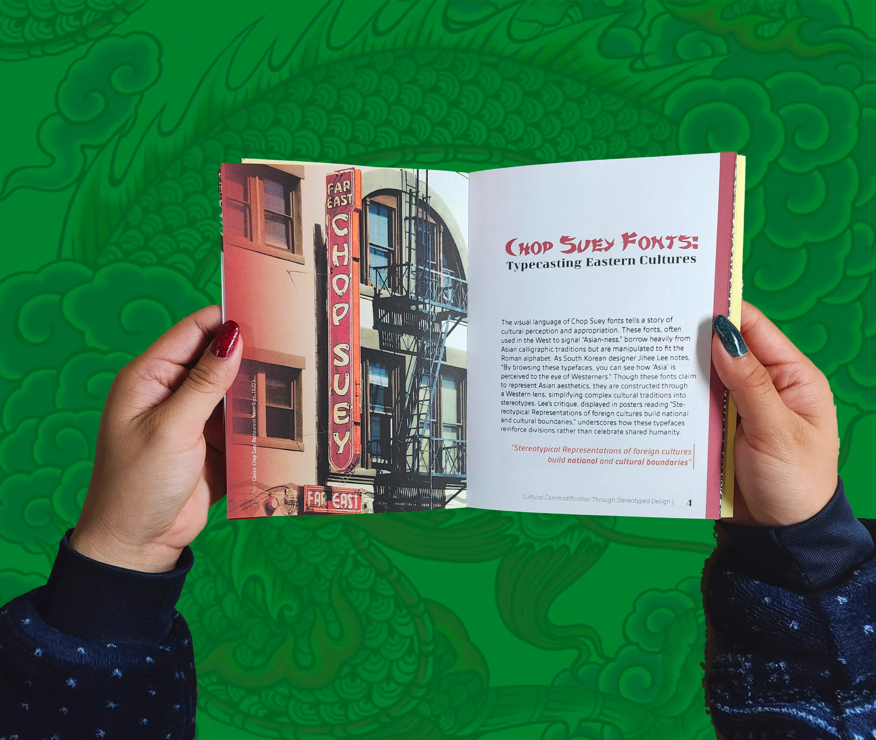
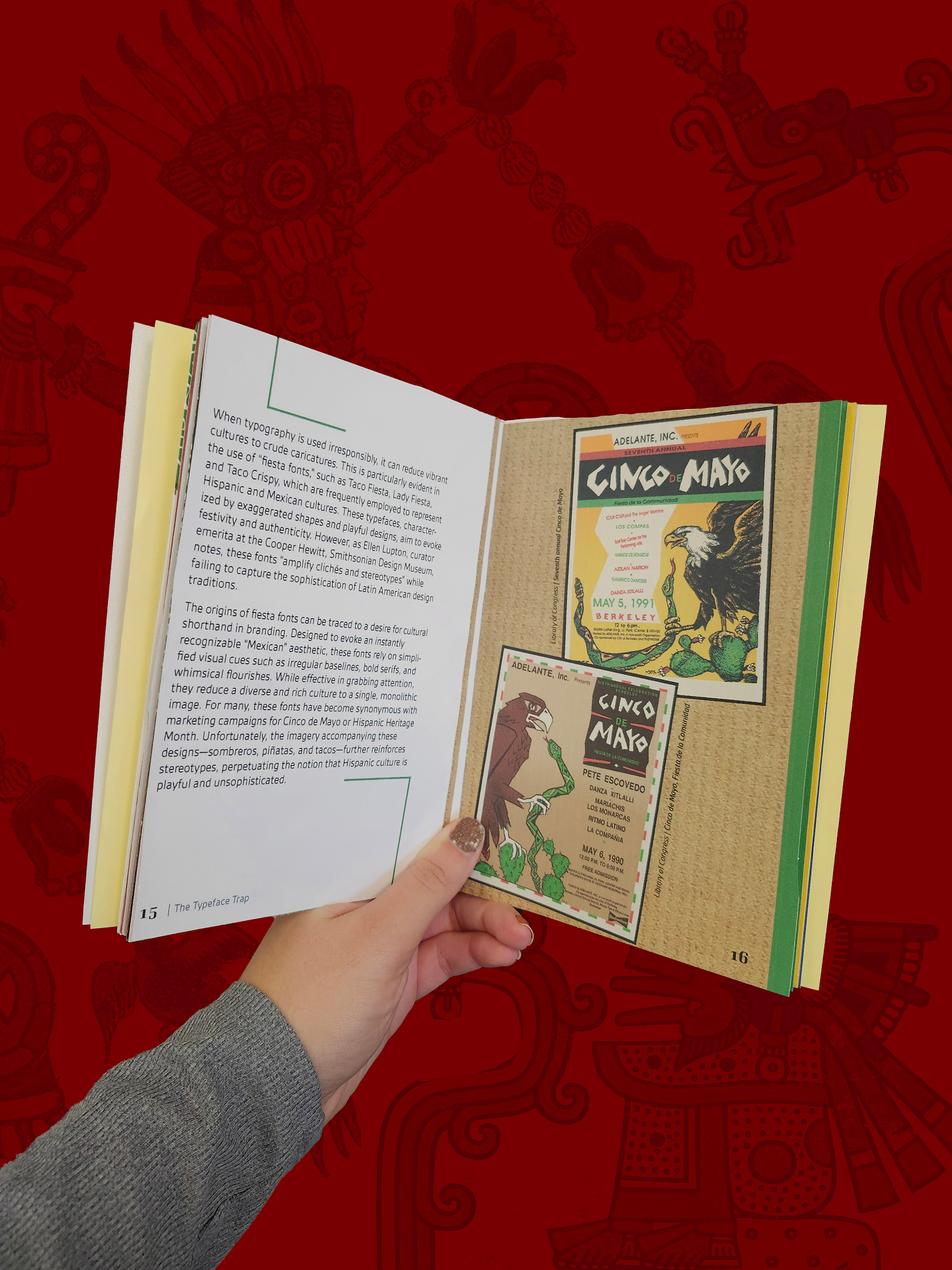
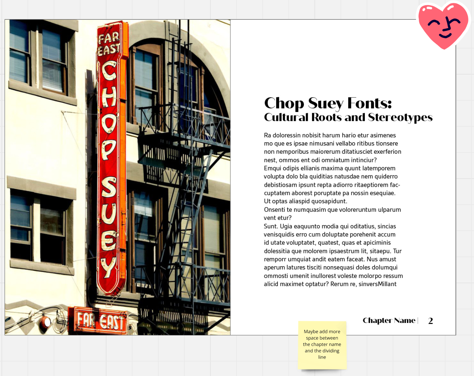
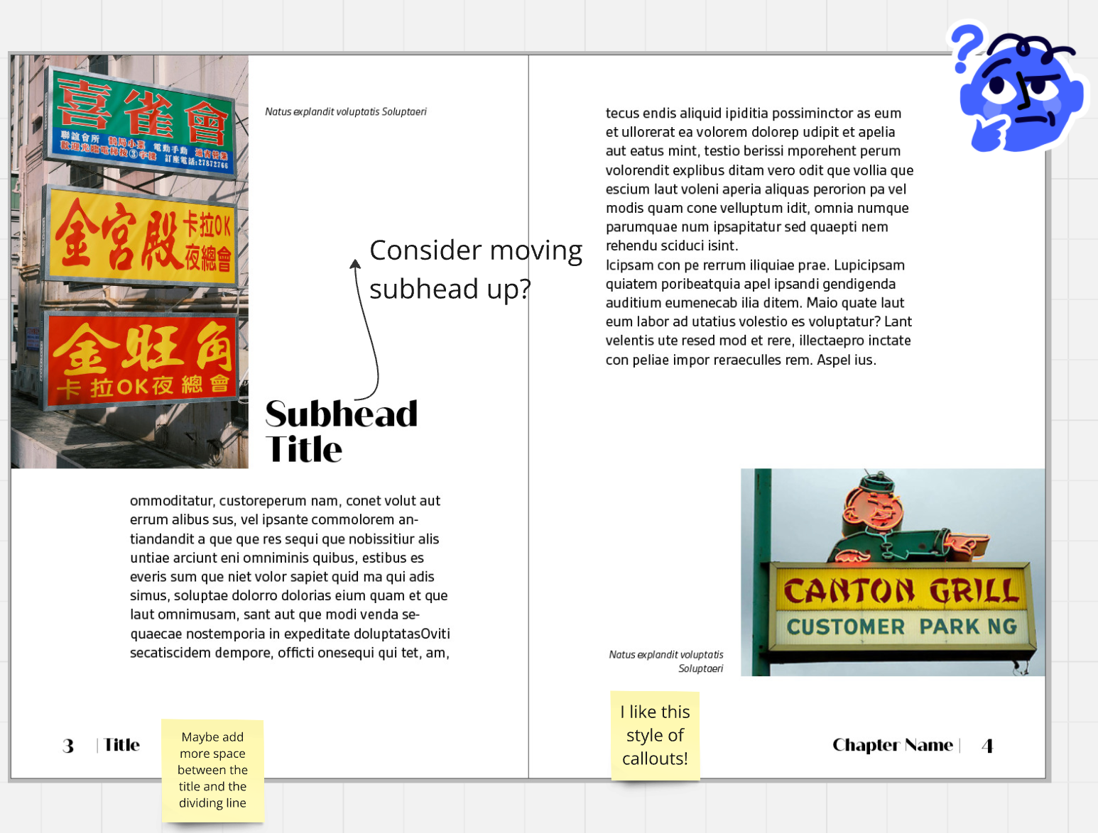
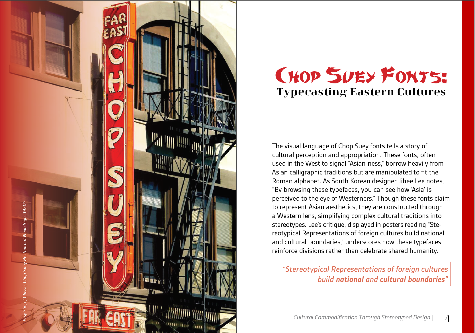
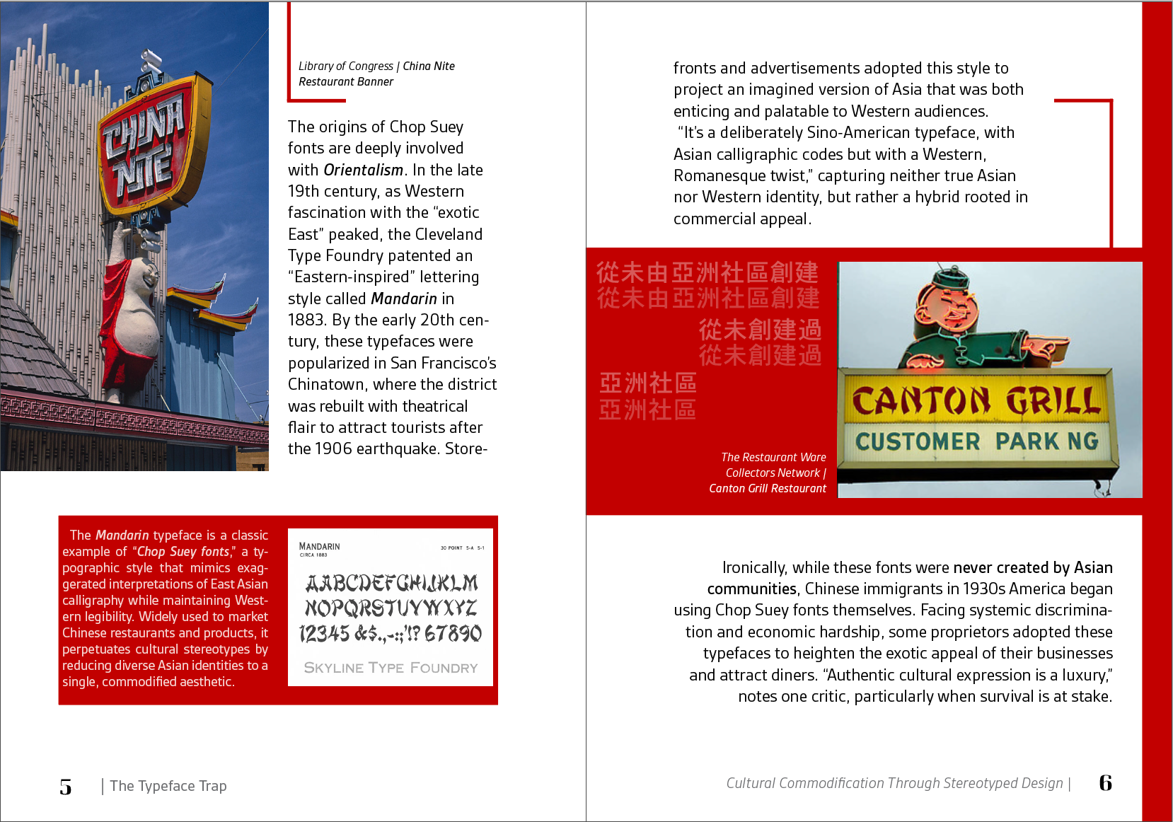
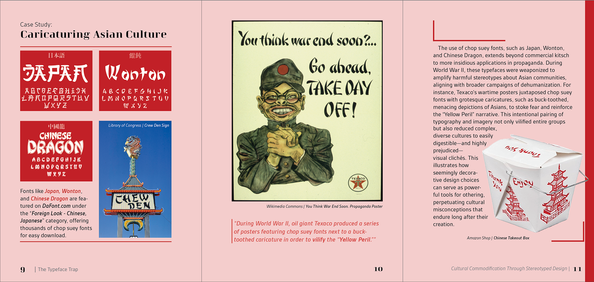
For my Type Study, I focused on the intersection of typography, cultural packaging, and imagery, examining how typefaces are used to represent cultures such as Mexican and Chinese identities, often through stereotypical visual cues. Drawing from design critiques, academic research, and voices like Juan Villanueva, I explored how these typographic associations were formed, how they commodify cultural narratives, and how they persist in contemporary design.
Through analyzing packaging and advertisements, I identified recurring visual patterns and connected them to broader historical and social contexts. This research informed both the written content and visual direction of the book, allowing me to challenge stereotypical representations and advocate for more culturally inclusive design practices.
*During my research, I noticed that many sources repeatedly cited one another, revealing both the interconnected nature of the discourse and a broader gap in widely explored perspectives on the topic.
Title Intent
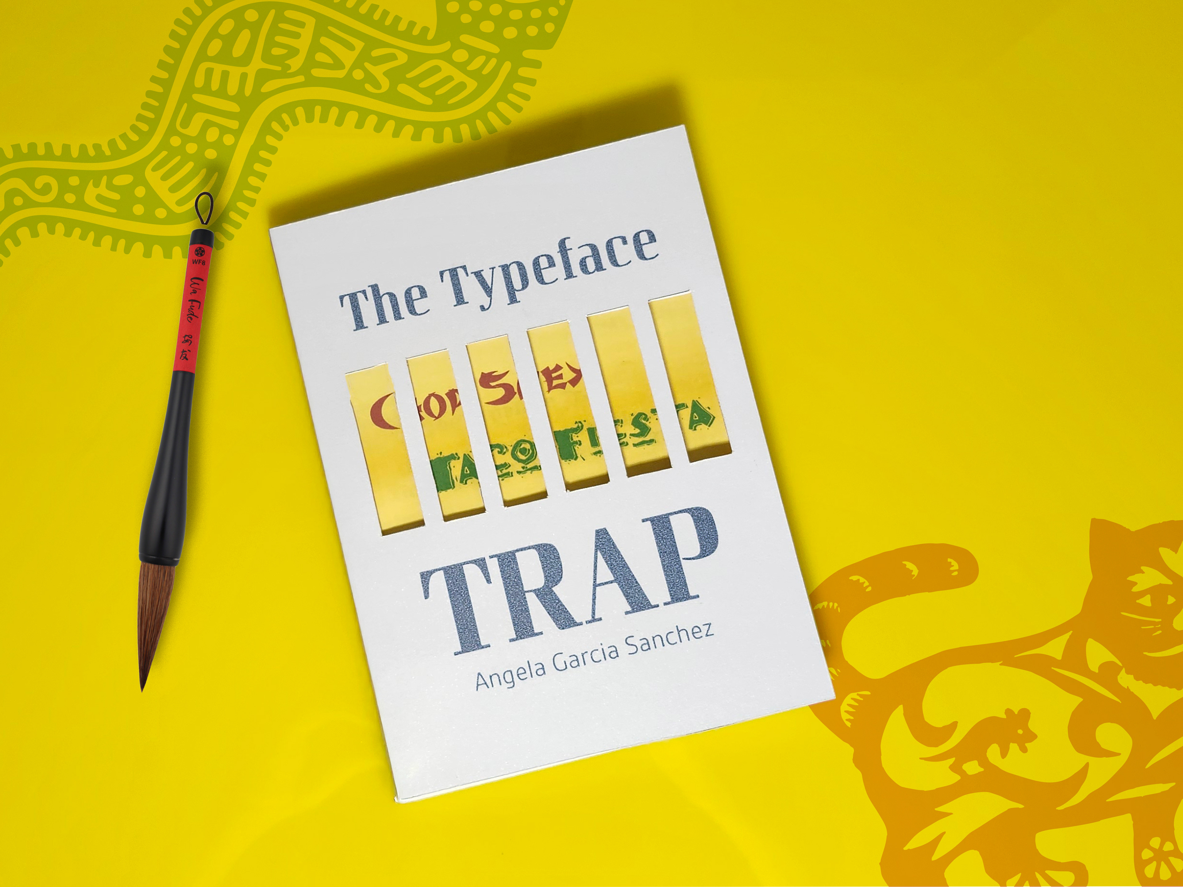
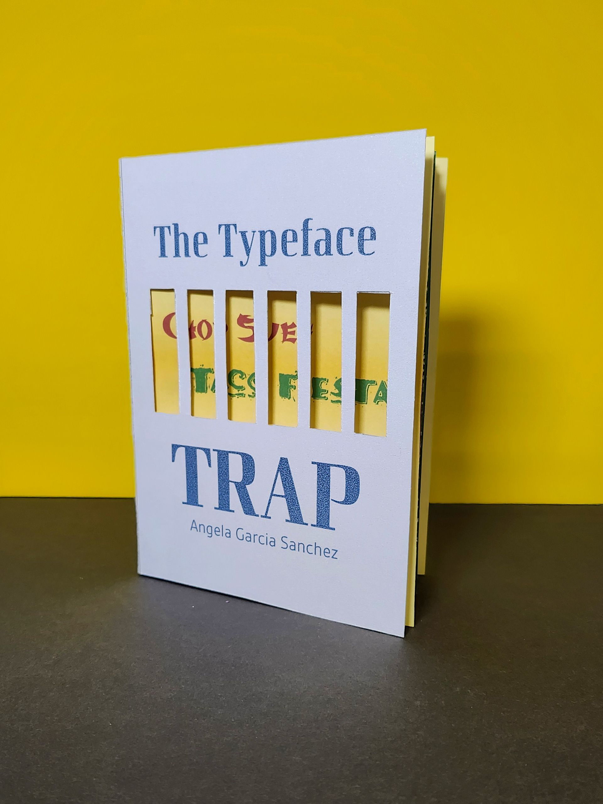
Selecting the book’s title was an intentional process, as I wanted it to reflect both the theme and its critical stance on typography’s role in cultural representation. I ultimately chose The Typeface Trap: Cultural Commodification Through Stereotyped Design because it captures the tension between stereotype and authenticity while clearly conveying the core focus of my research.
Brainstorming Ideas:
• Mispackaged Identities Through Type
• How Typography Sells and Stereotypes Cultures
• The Commodification of Identity Through Typography
• Cultural Commodification Through Stereotyped Design
────────────
Translating into InDesign:
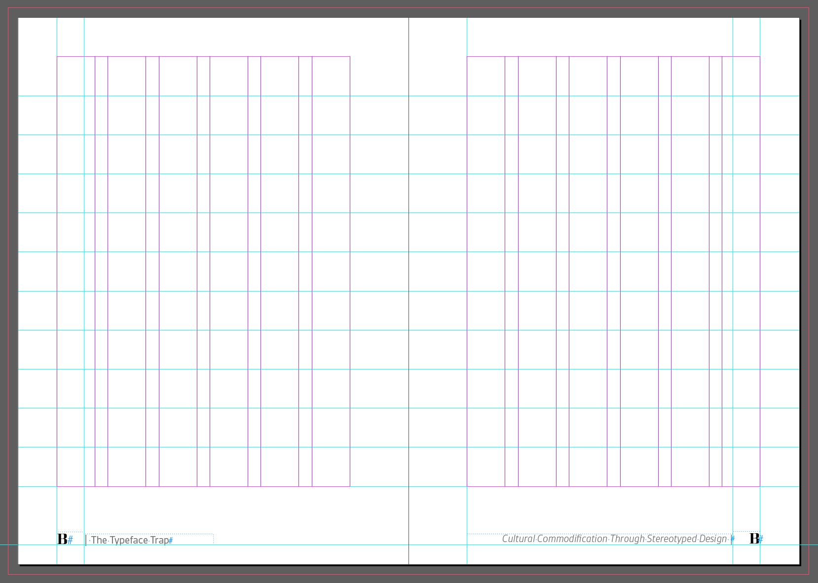
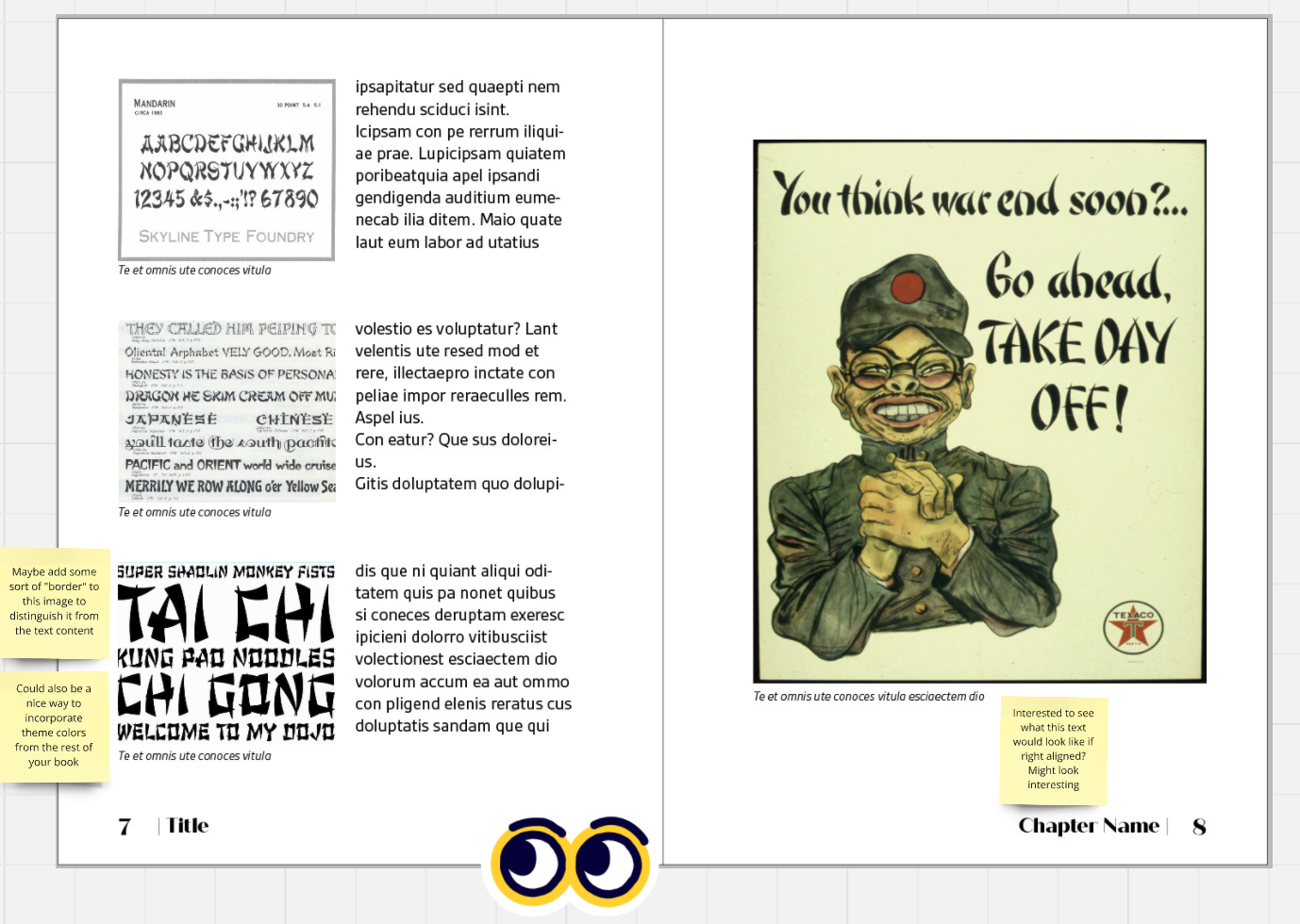
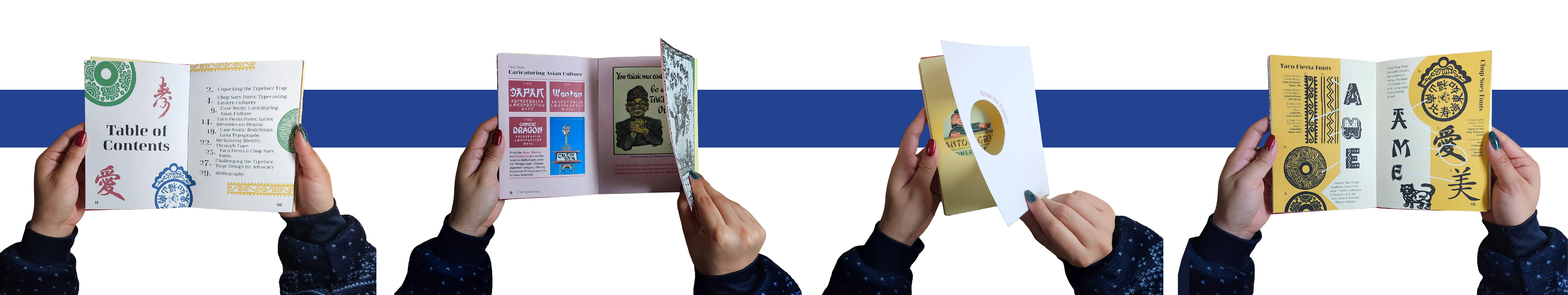
After finalizing and proofreading my research, I transitioned the content into InDesign and selected a 5” × 7” page size (10” × 7” spread) to fit within letter-sized printing requirements with crop marks. I structured the layout using a six-column grid with ½-inch horizontal increments to maintain consistency and visual balance throughout the book.
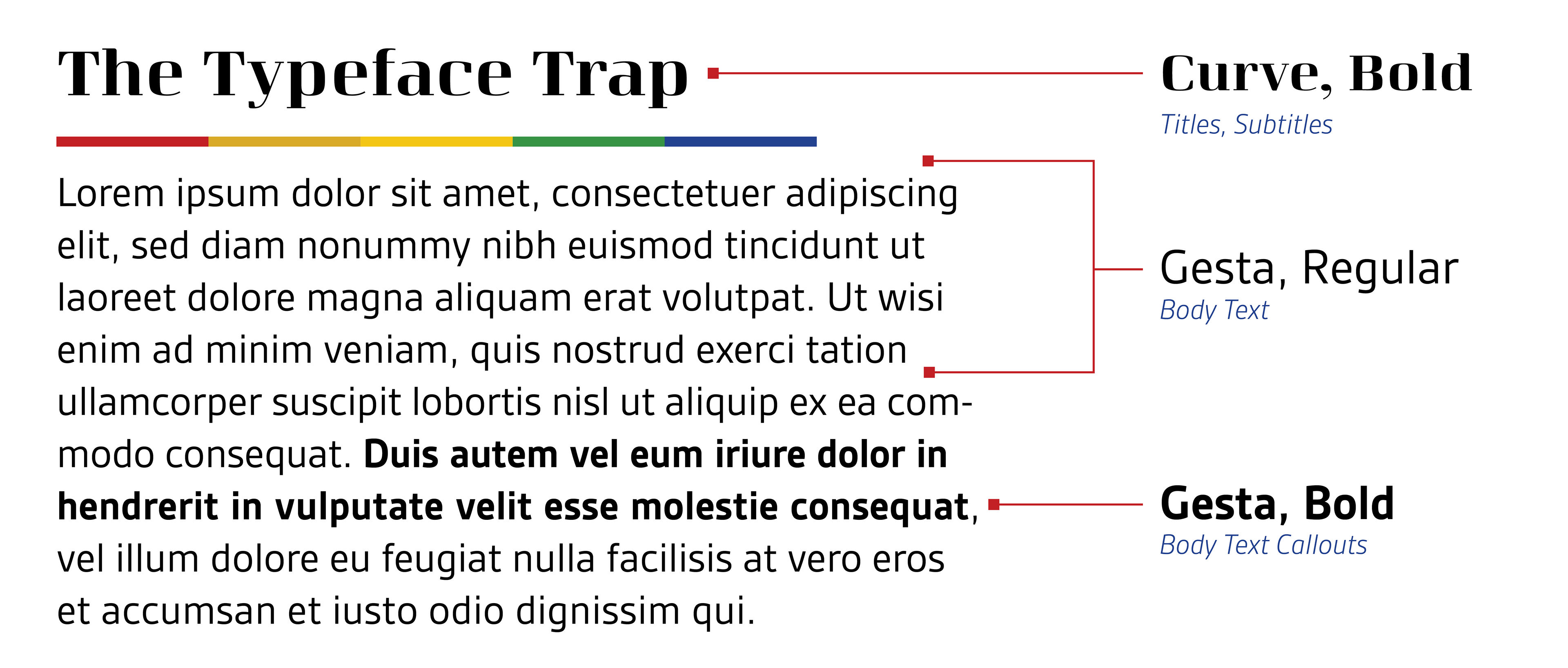
When choosing the typefaces, I wanted to avoid using fonts that were directly tied to the stereotypes discussed in my work, opting instead for something more universal and open to interpretation. I was aiming for typefaces that were professional and serious in tone to create a cohesive and refined design.
Layout Design Before
Layout Design After
────────────
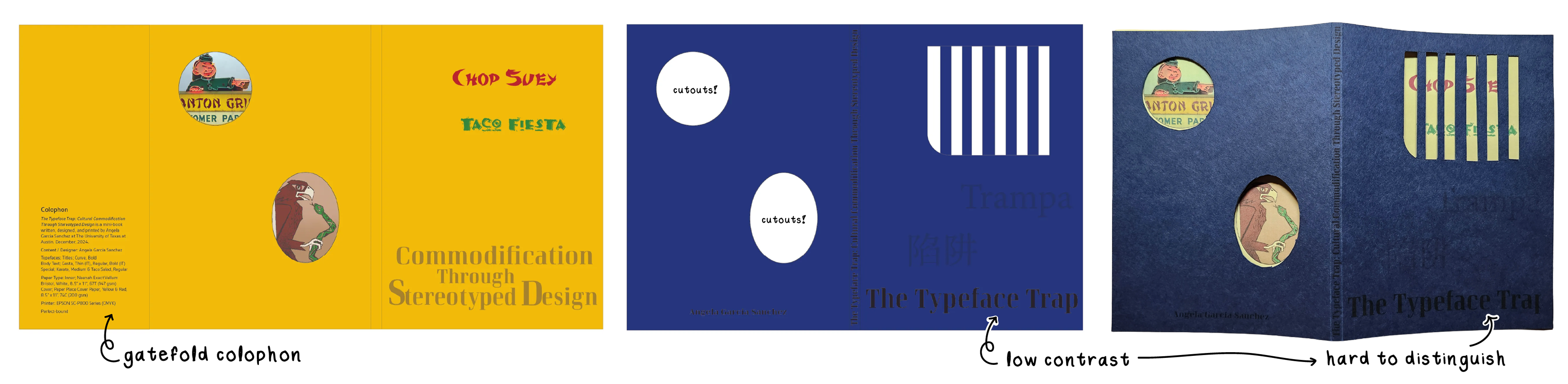
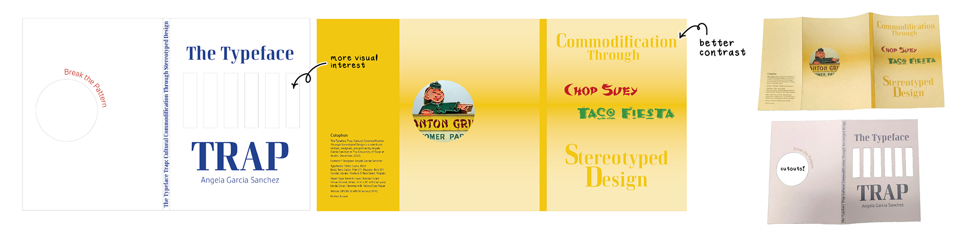
Cover Design
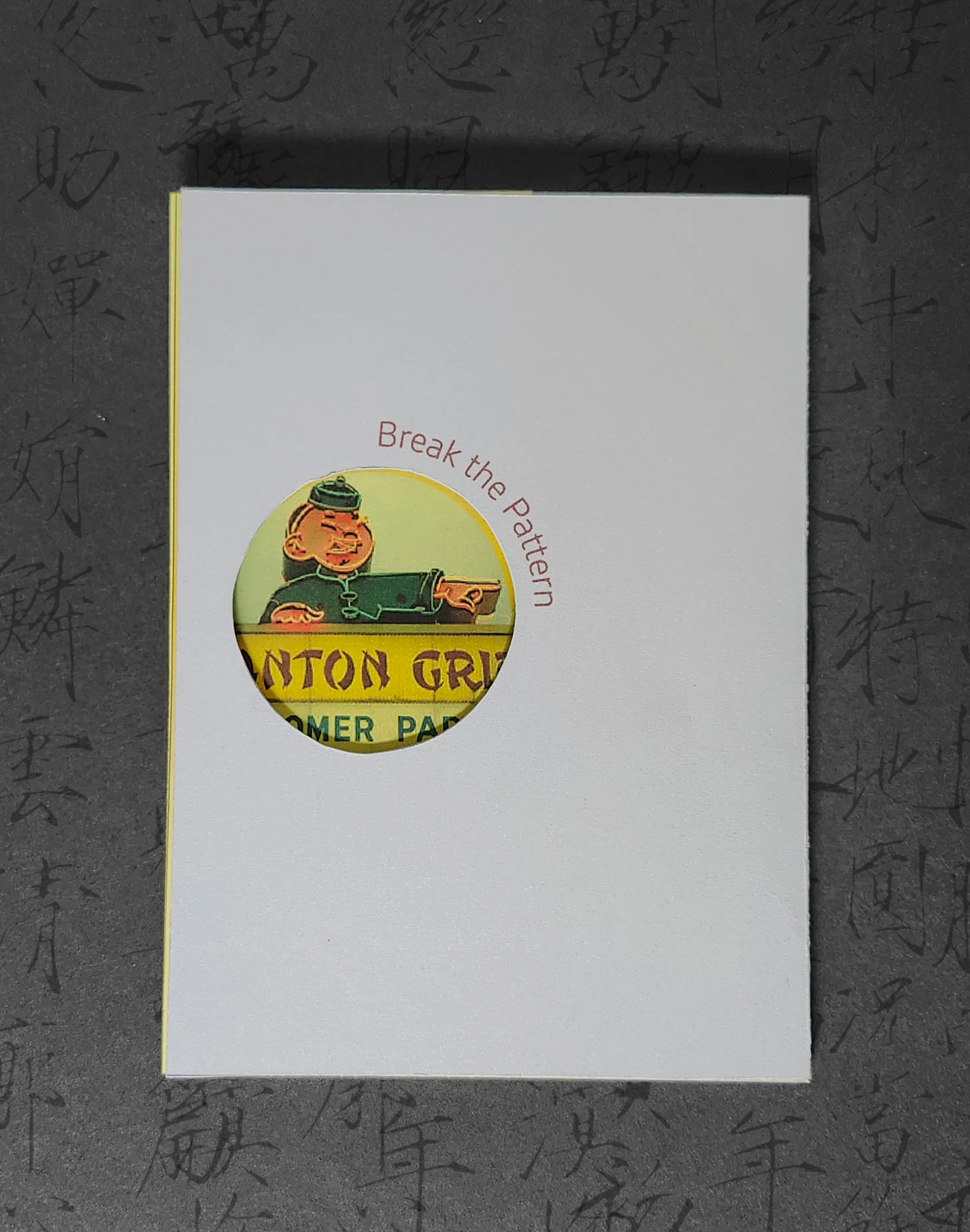
I initially struggled with how to visually “sell” the book’s narrative, but the word Trap in the title inspired a conceptual direction. I developed a jail-cell metaphor, using die-cut bars to symbolize how stereotypical fonts confine cultural identities, reinforcing the book’s critique of commodified representation. A subtle “Break the Pattern” message on the back further echoes this call to challenge design conventions.
After testing a dark blue cover that lacked contrast, I revised the design using white paper to improve legibility and unify the book’s color palette. Enlarging the die-cut bars strengthened both the visual clarity and the metaphor of confinement, enhancing the overall narrative impact.
────────────
Reflection
From conceptualizing the narrative to resolving printing and alignment issues, every step required adaptability and problem-solving. The project deepened my understanding of typography's role in shaping cultural perceptions and reinforced the importance of accurate, respectful representation in design. Incorporating feedback, experimenting with materials, and assembling the book by hand added a personal and meaningful touch. Ultimately, this experience not only enhanced my technical skills but also strengthened my commitment to culturally inclusive design and challenging conventions in future work.