Auréla is brand identity for an aromatherapy product line rooted in sustainable wellness and natural healing. The visual system features watercolor elements and nature-inspired motifs, reinforcing the brand’s calming essence. Versatile packaging was designed for a variety of products including candles, essential oils, and incense, all made using eco-friendly materials. Overall, the identity successfully blends modern aesthetics with organic elements, making it both functional and emotionally resonant for a target audience that values sustainability, mindfulness, and natural remedies.
How can a brand identity for an aromatherapy product line communicate relaxation, sustainability, and natural healing while creating a cohesive system across multiple products?
Branding, Layout, Packaging Design
Tools: Adobe Illustrator, InDesign, Photoshop, Miro
Timeline: 5 weeks
────────────
Discovery
This project aims to develop a cohesive brand identity for a nature-inspired, sustainable aromatherapy company focused on healing, relaxation, and mental clarity. Offering essential oils, diffusers, candles, sprays, and salts, the brand will emphasize eco-conscious luxury, using ethically sourced ingredients and sustainable packaging. Competing with brands like Saje, Vitruvi, and doTERRA, it will stand out through its commitment to holistic wellness, transparency, and environmental responsibility. The final Brand Identity System will ensure consistency across product packaging, and marketing materials, documented in a comprehensive Brand Guidelines Book.
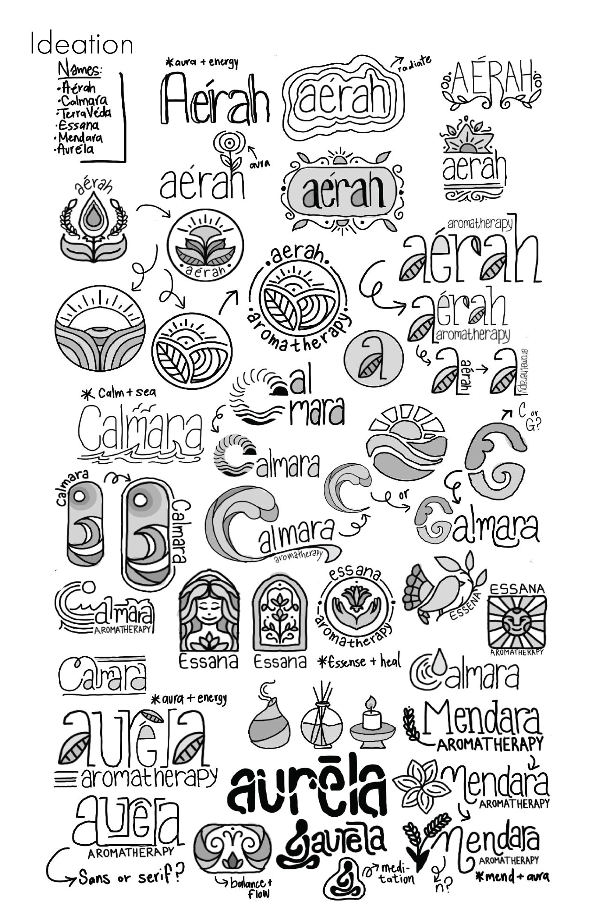
Name Ideation : Aérah, Calmara, TerraVéda, Essana, Mendara, & Auréla
Deep Dive
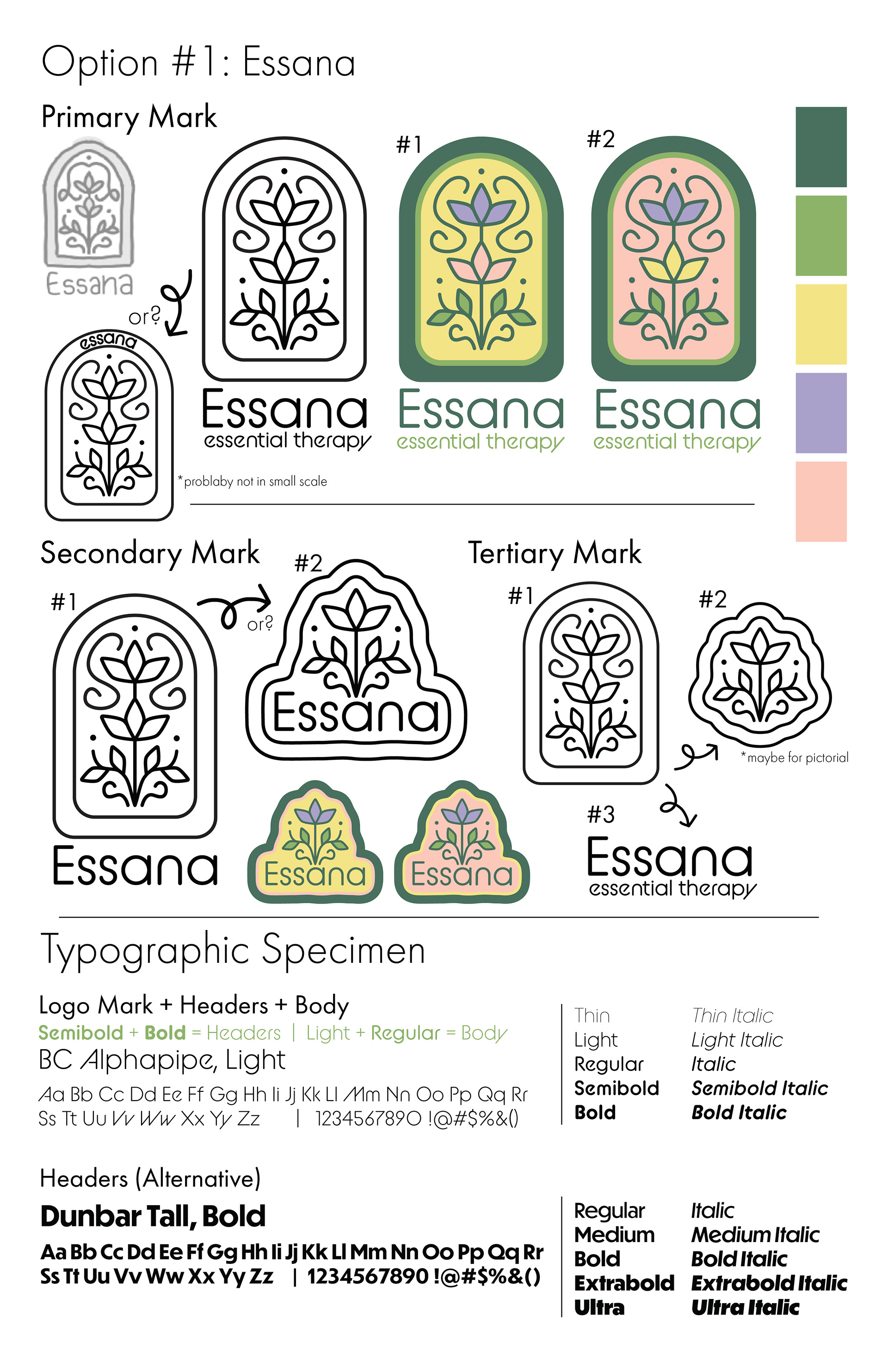
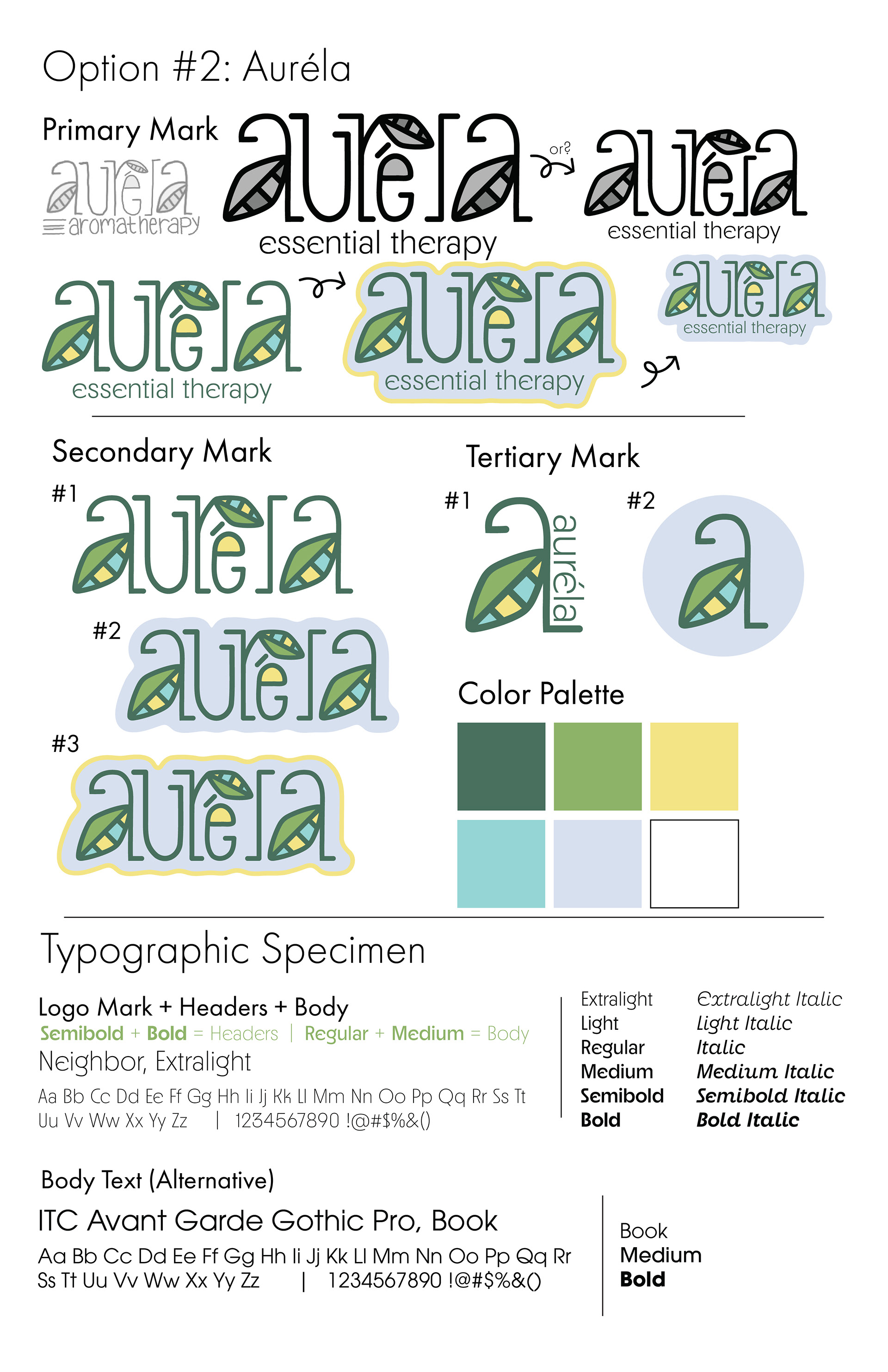
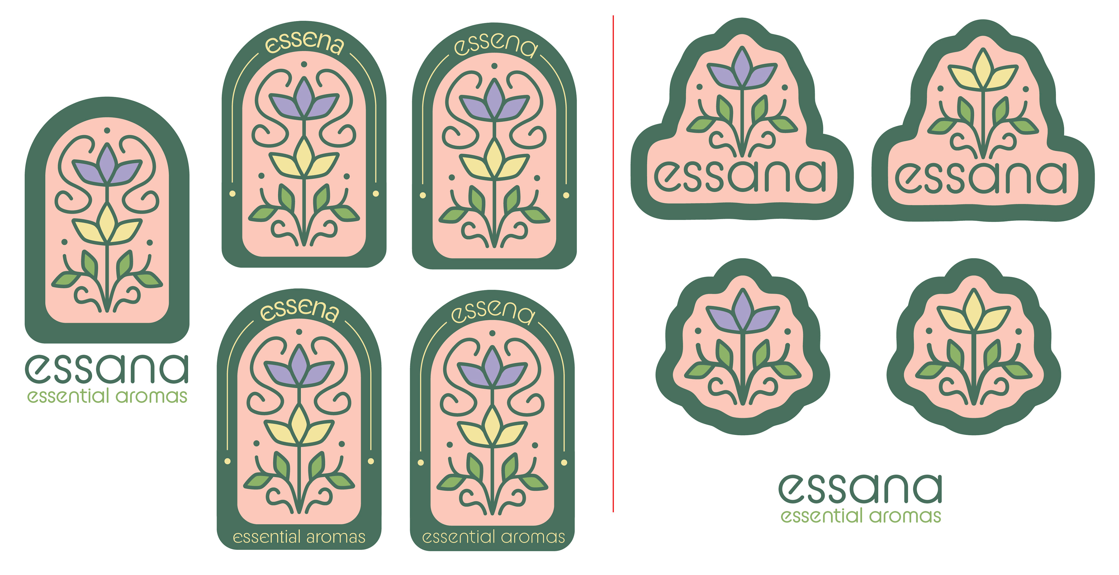
I explore Essana with a symmetrical logo mark, and Auréla with a more free-form approach. Both ideas take into consideration a natural look and aesthetic that symbolizes the efforts of natural and sustainable products. The typography features clean and somewhat symmetrical typefaces that add sophistication, clarity, and approachability.
Refinement
Essana is most successful as an aromatherapy brand with a brand image that is most consistent with what’s on the market. The symmetrical logo, soft typeface, and color palette exemplify my desired brand message. However, Auréla is an out-of-the-ordinary logo with playful and nature-inspired motifs and colors. The major recommendation was to focus on a branch of aromatherapy like essential oils, essences, or tinctures.
────────────
Implementation
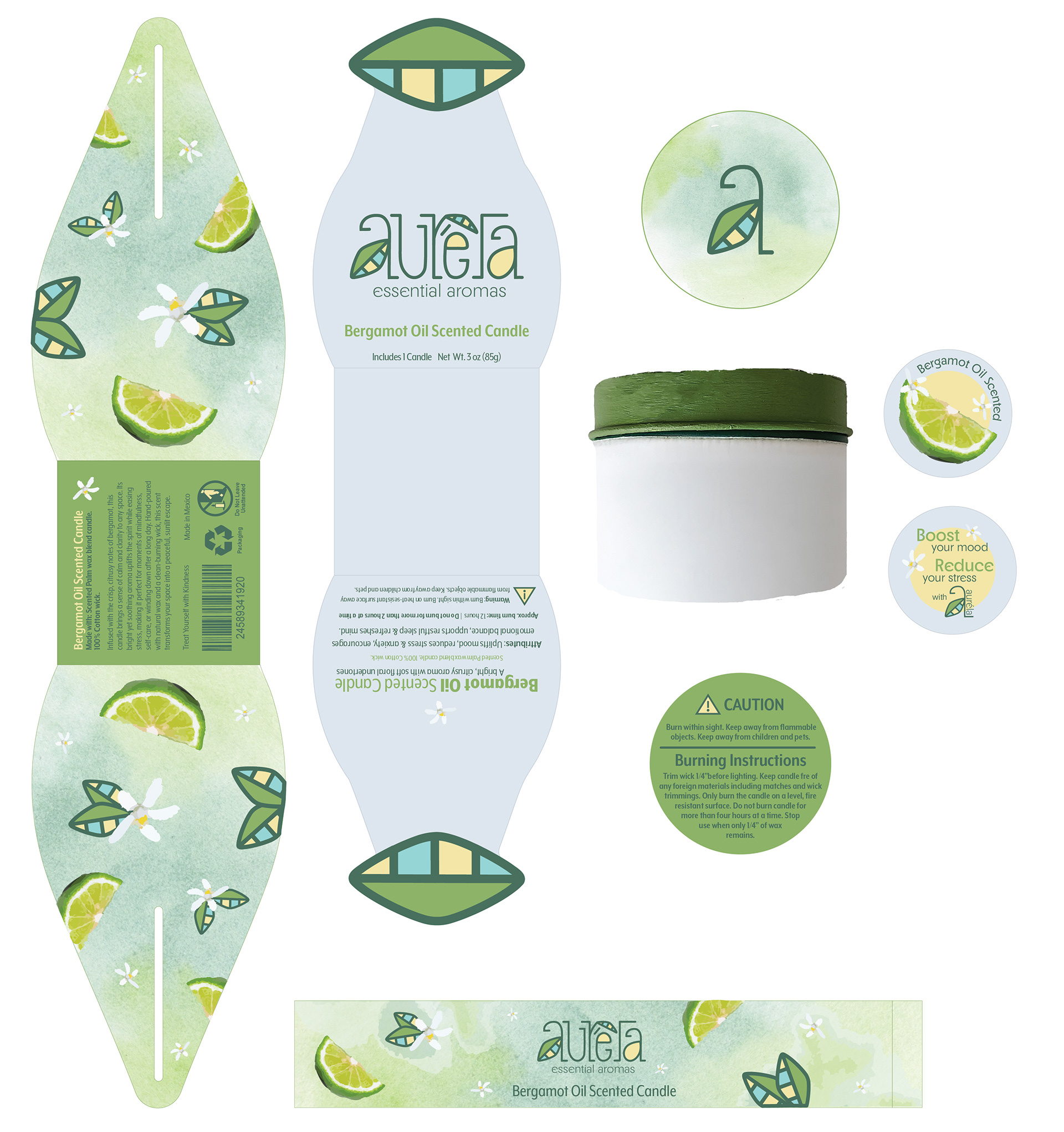
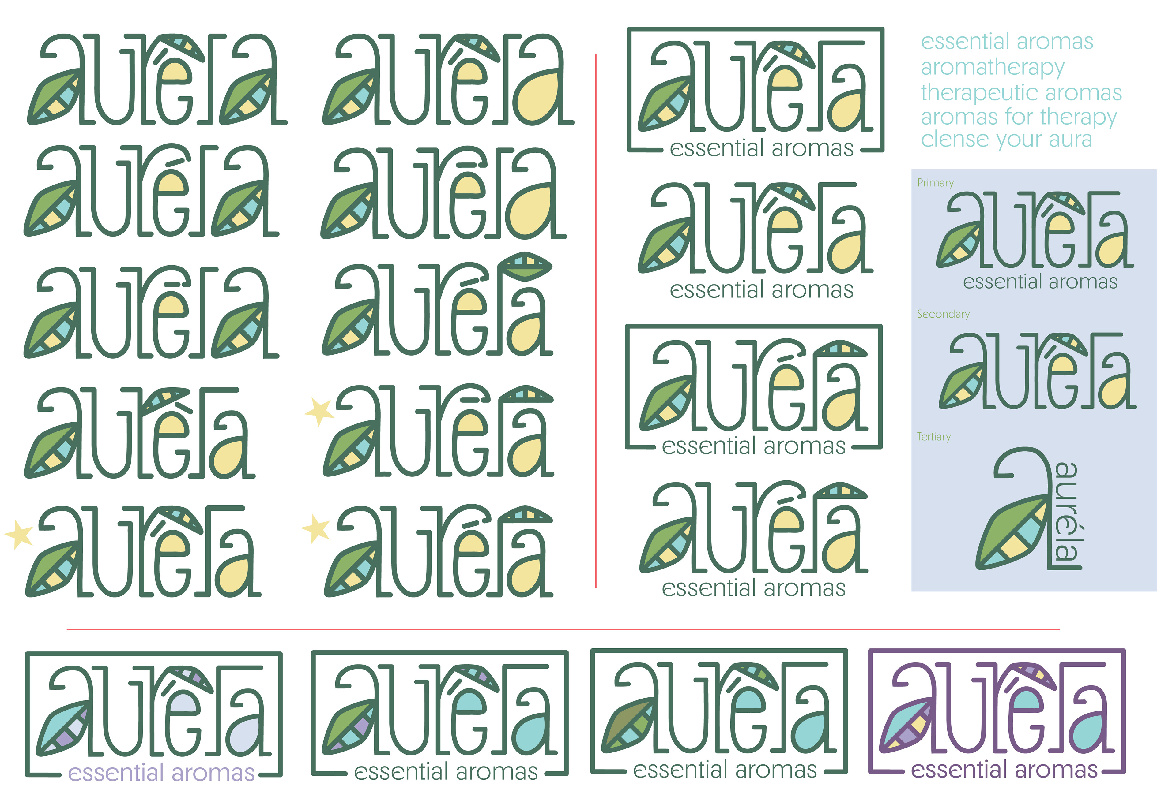
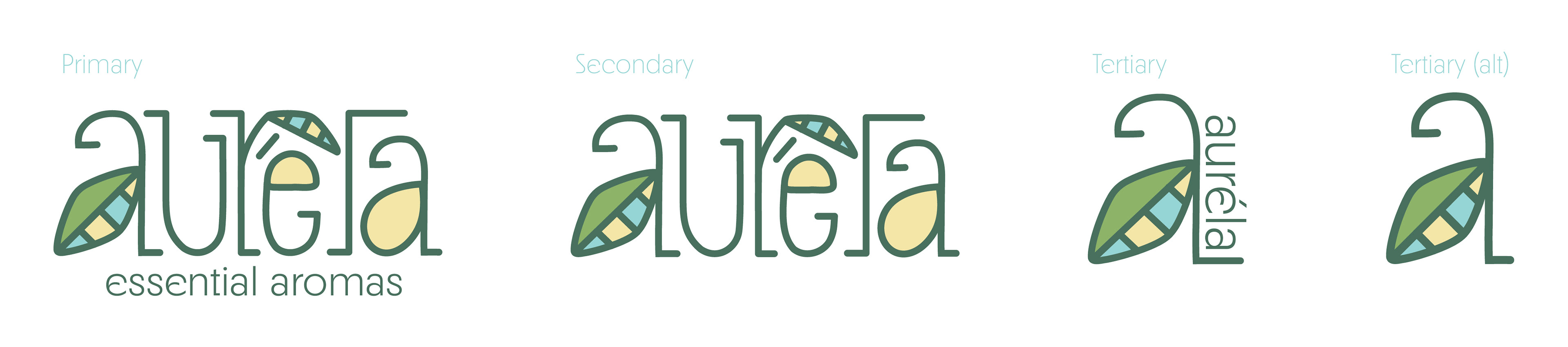
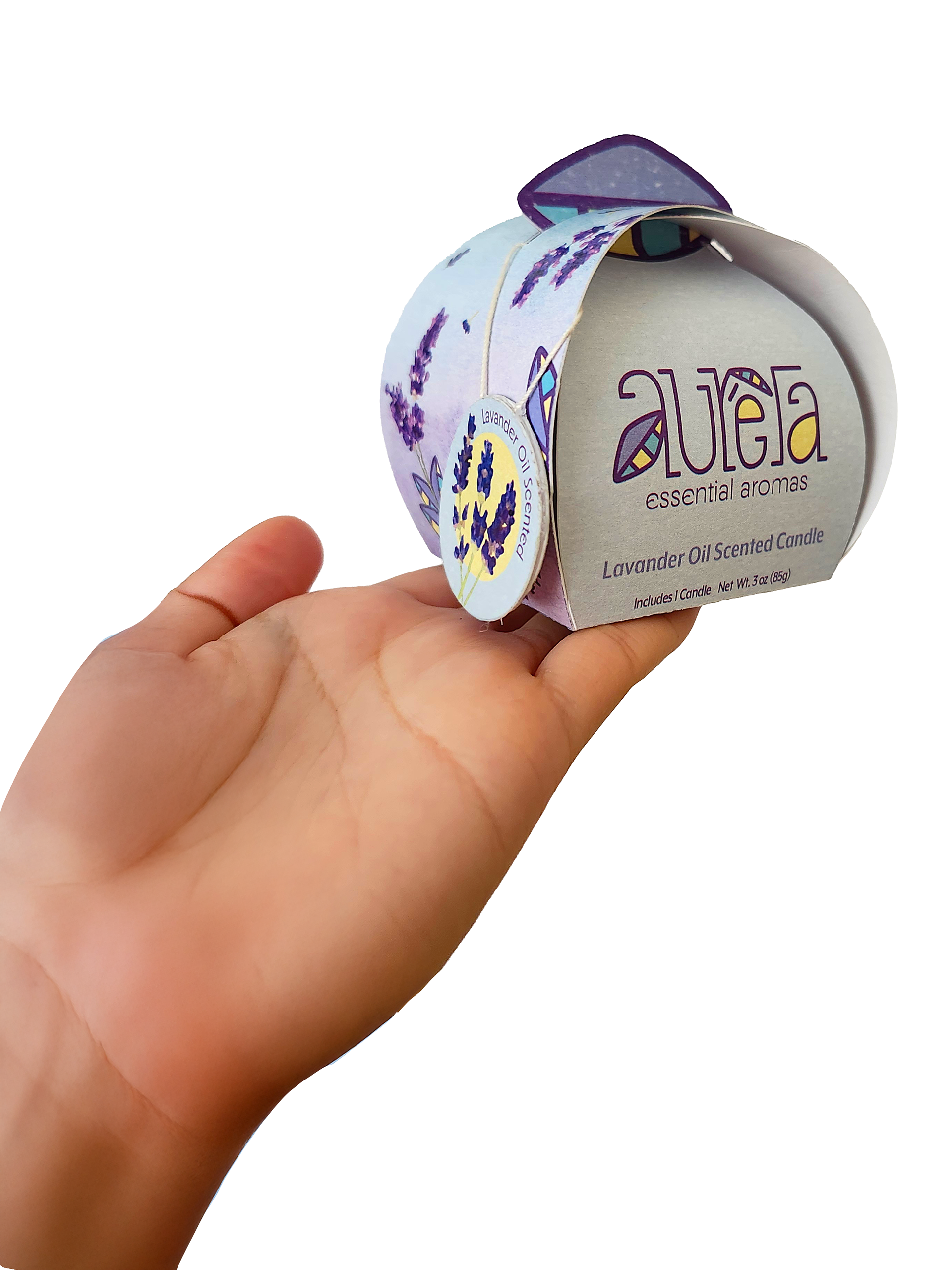
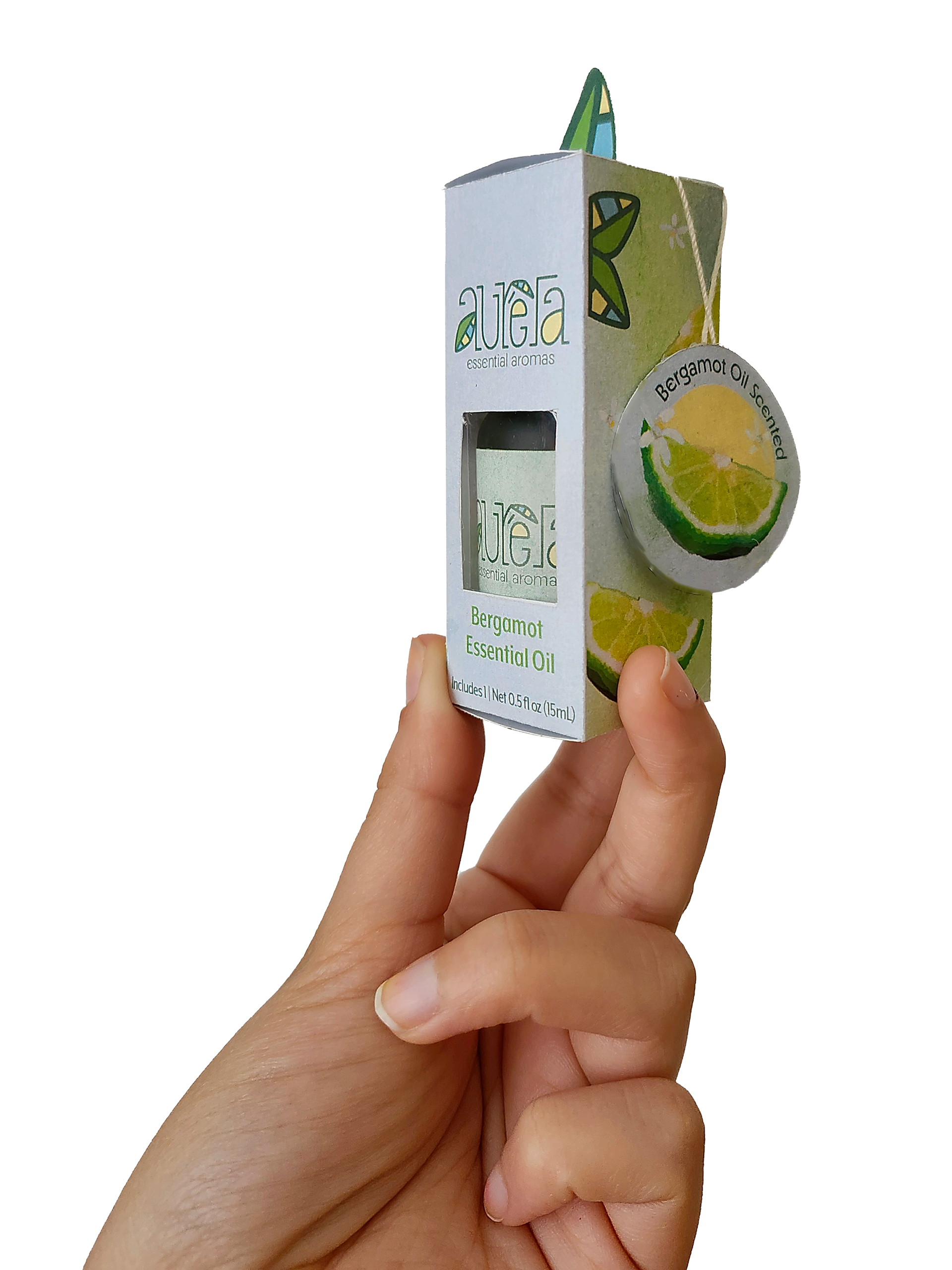
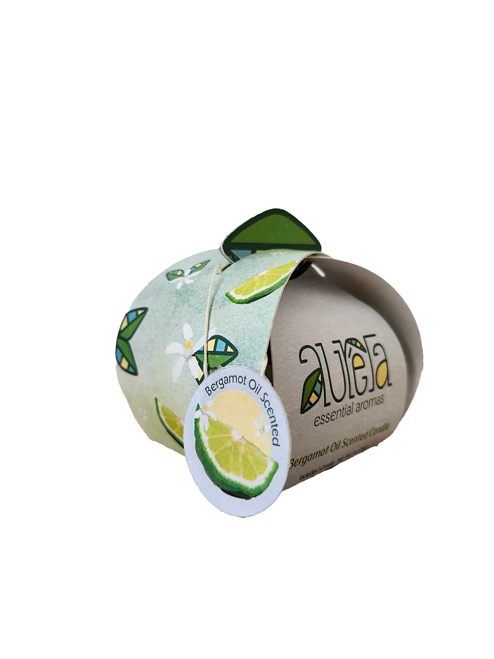
Logo Marks: The Auréla logo marks were designed to reflect the brand’s relaxed and calming vibe. The leaf element paired with soft shapes and earthy colors gives off a peaceful, nature-inspired feel that ties perfectly into the idea of relaxation and essential aromas.
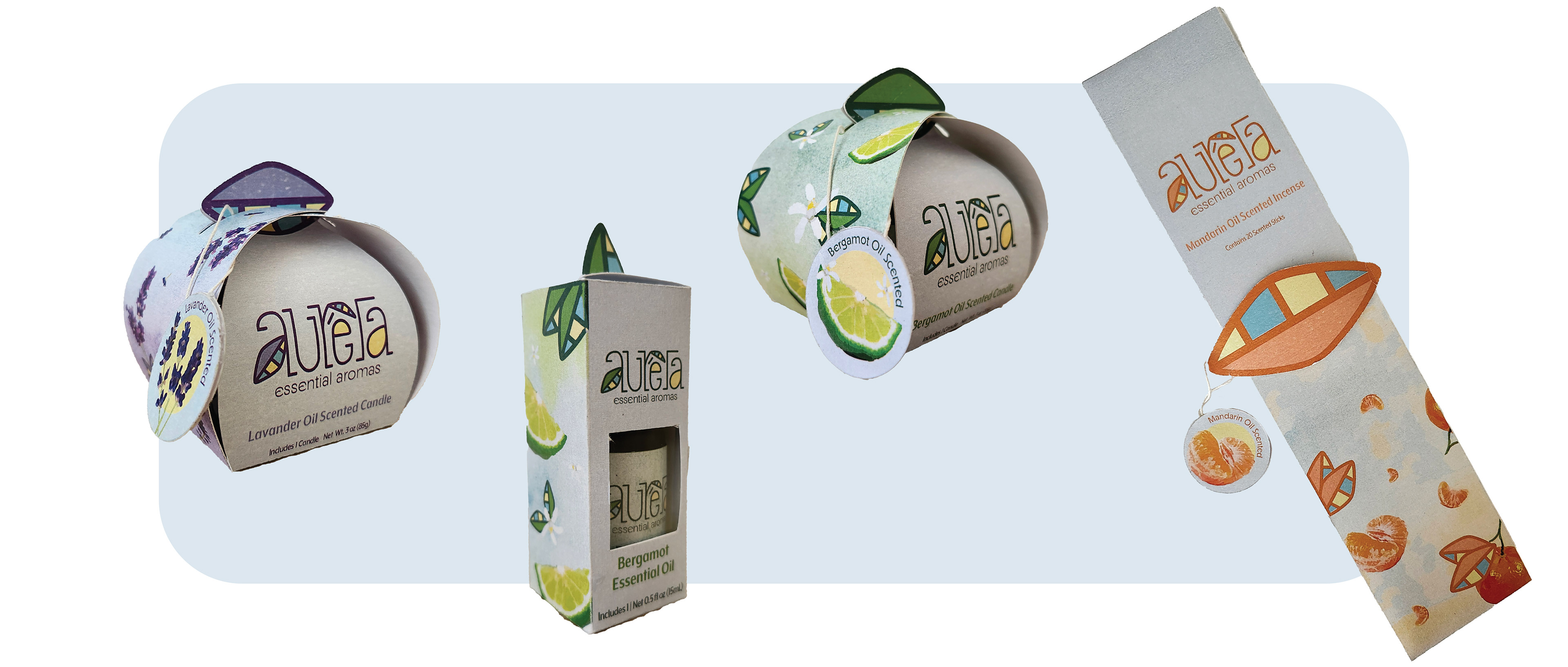
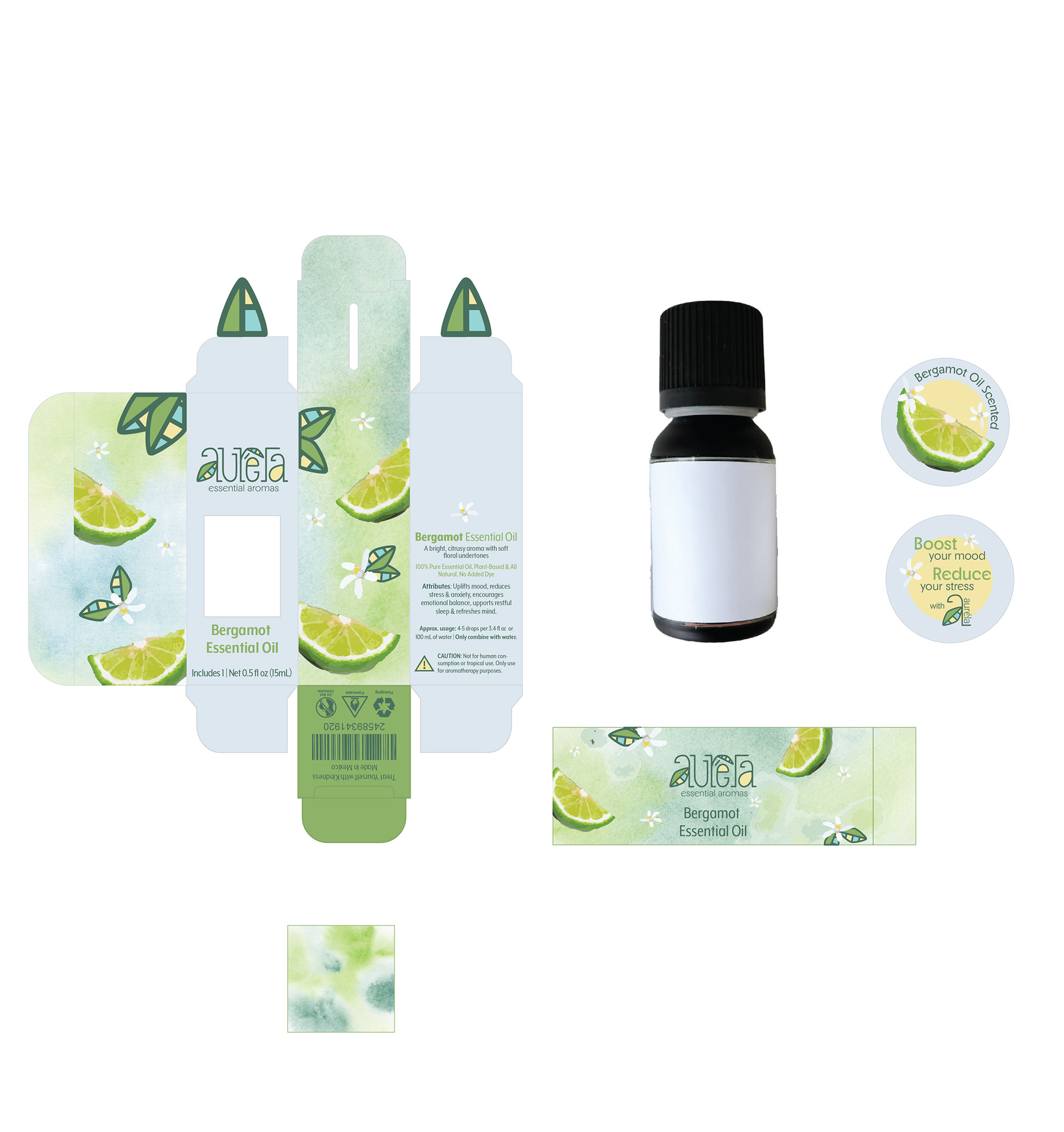
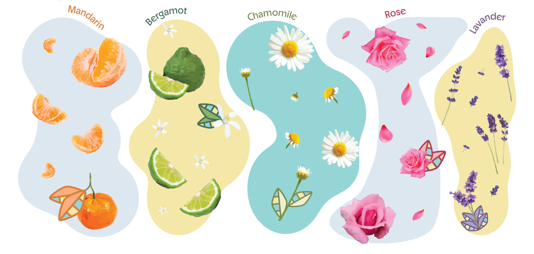
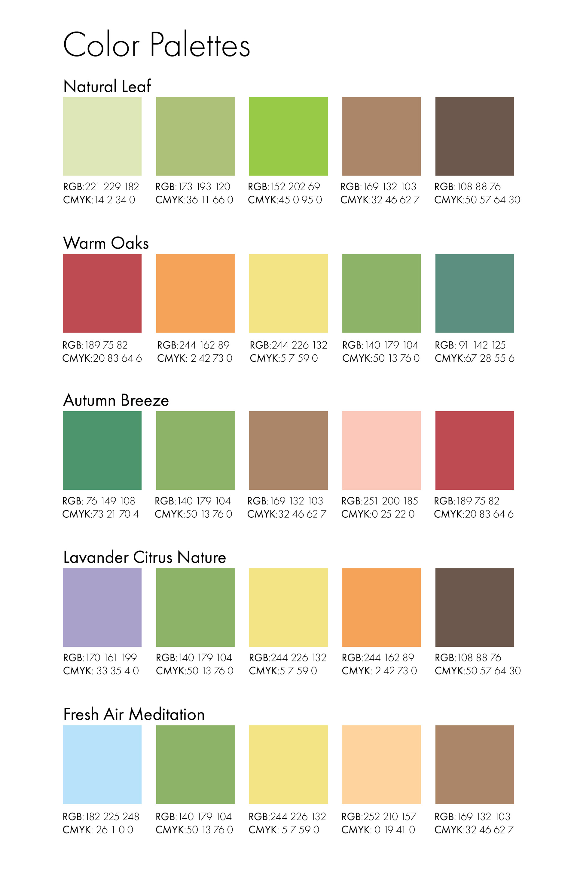
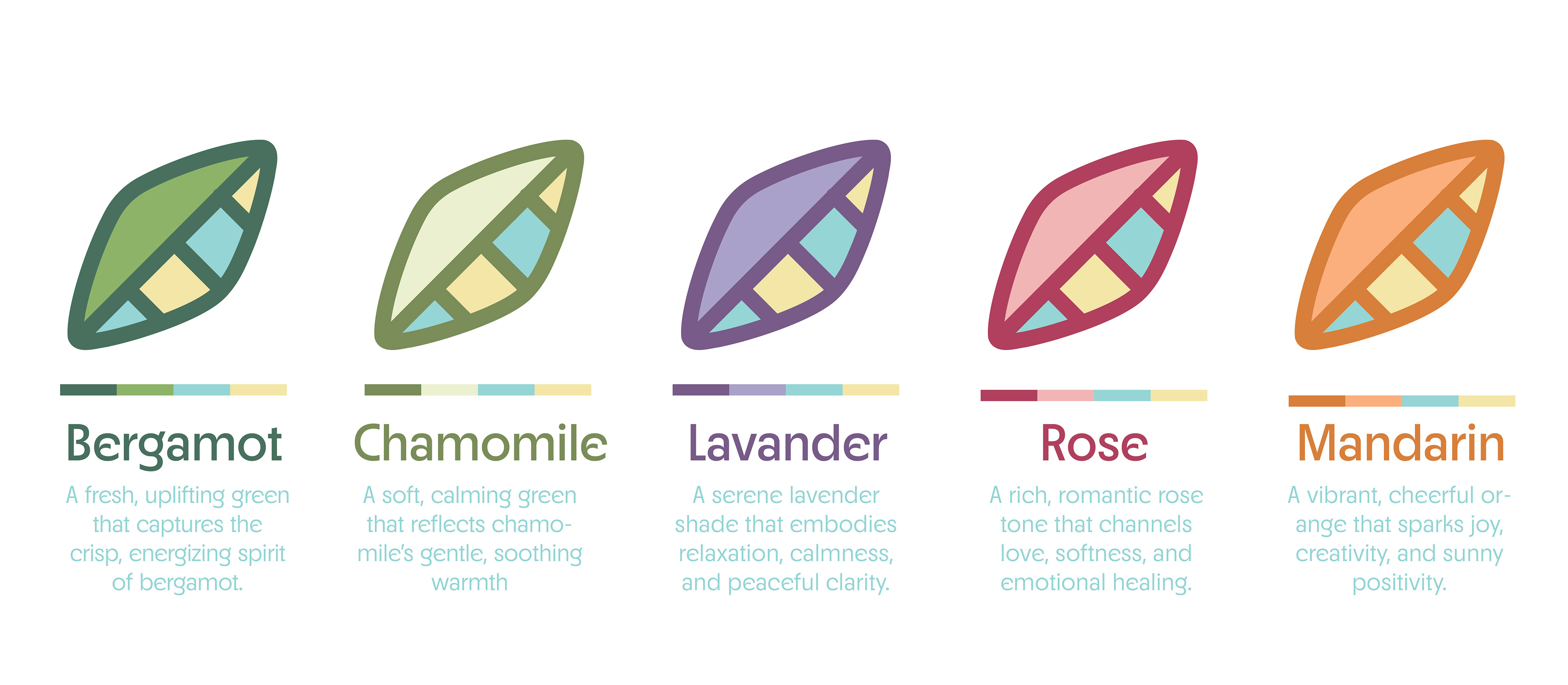
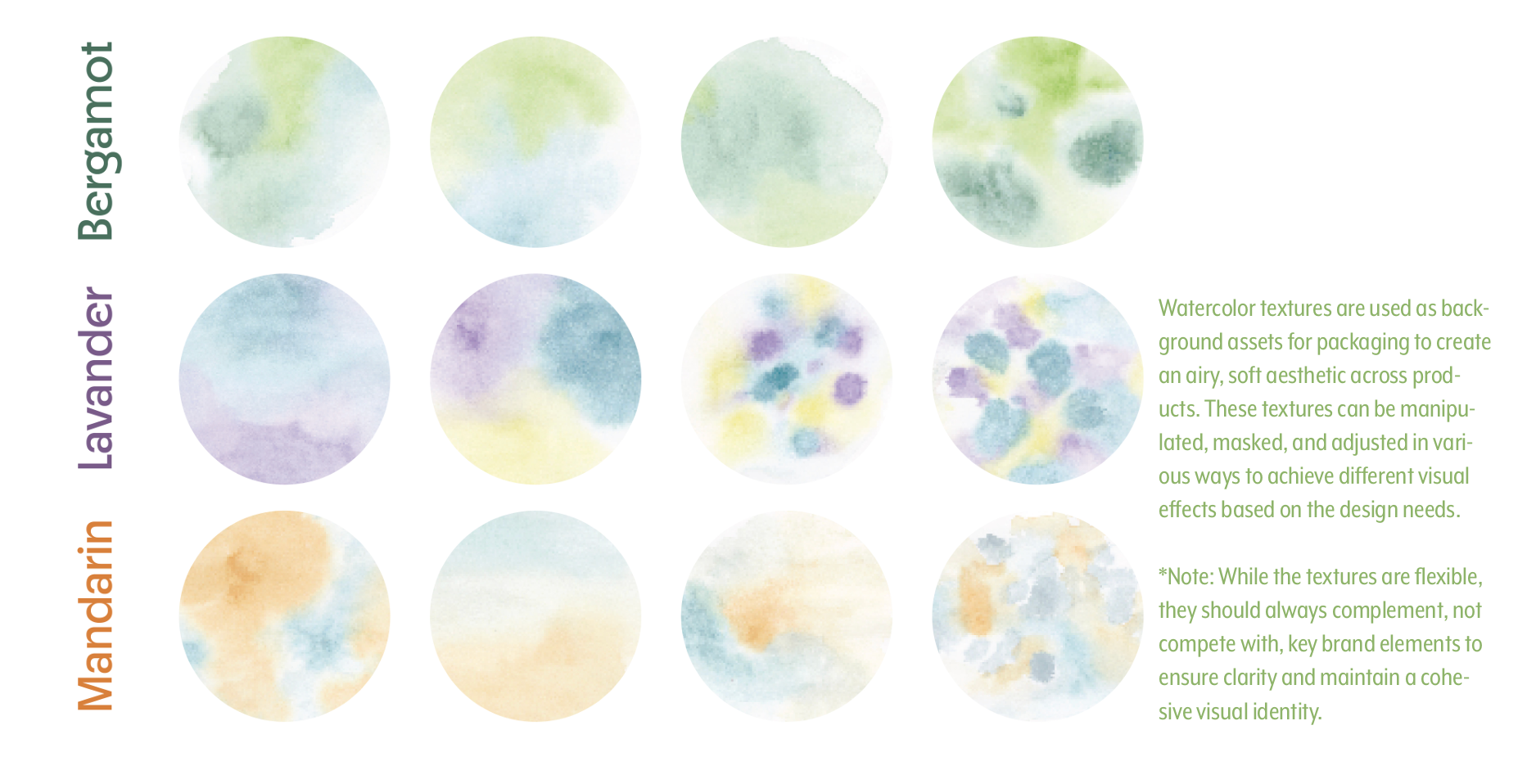
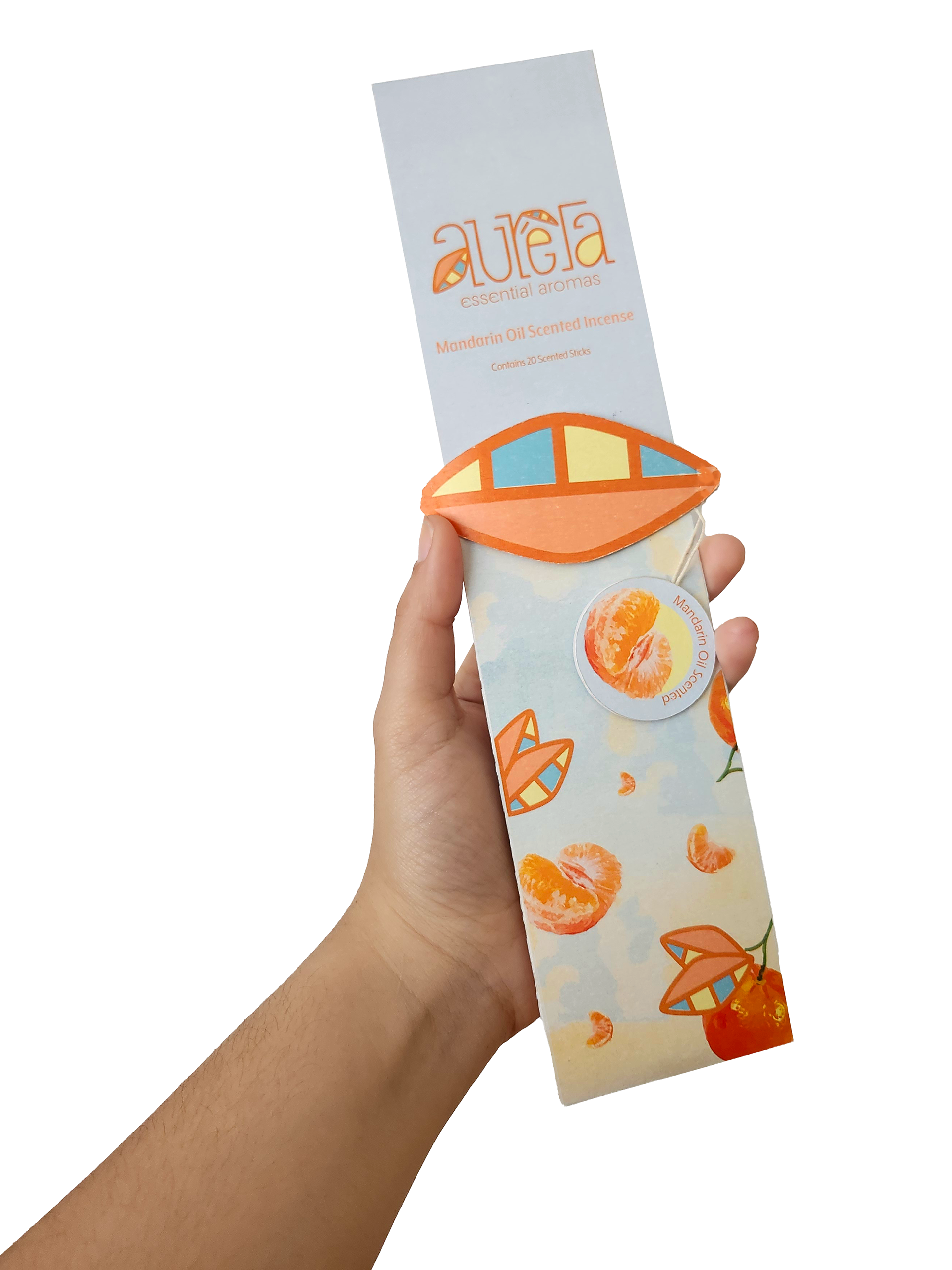
Color Palette: Each aroma in the collection is assigned a unique color palette that draws directly from the natural characteristics of the plant or fruit it’s made from. By aligning each product's visual identity with its origin, the packaging becomes both intuitive and expressive, enhancing the customer’s connection to the scent before they even open the box.
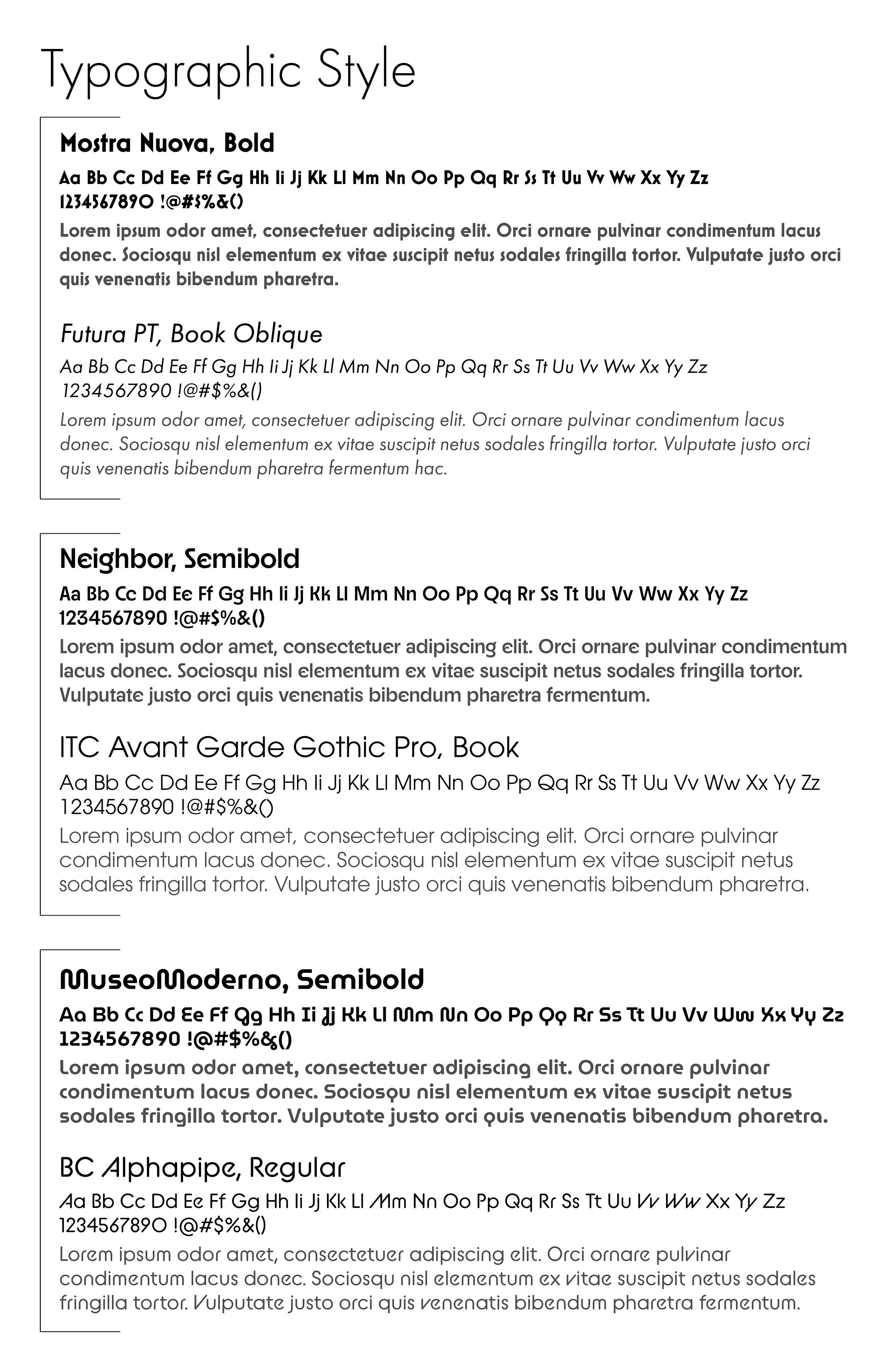
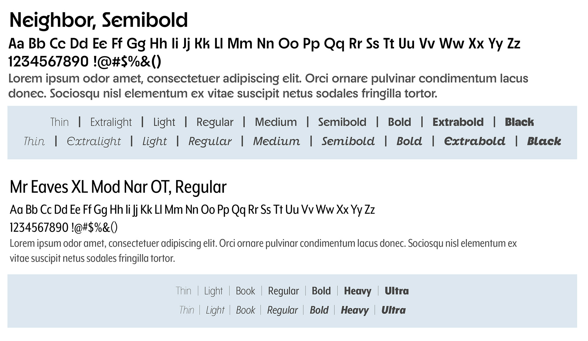
Typography: Because the logo mark is based on my own handwriting, it was important that the main typeface echoed some of the handcrafted, organic qualities of the logo without competing with it. I wanted something that felt subtle and clean, yet still carried a sense of personality to reflect the brand’s calming and nature-inspired tone.
────────────
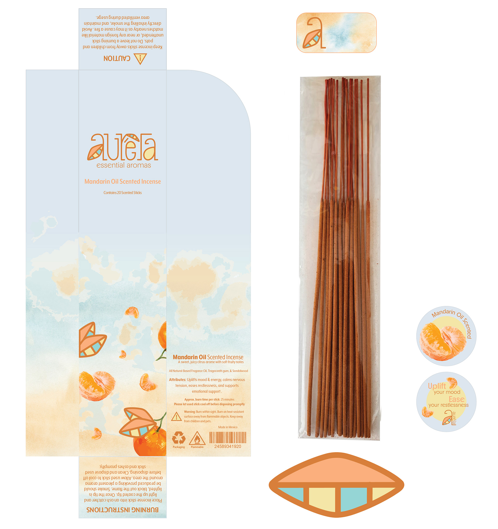
Packaging
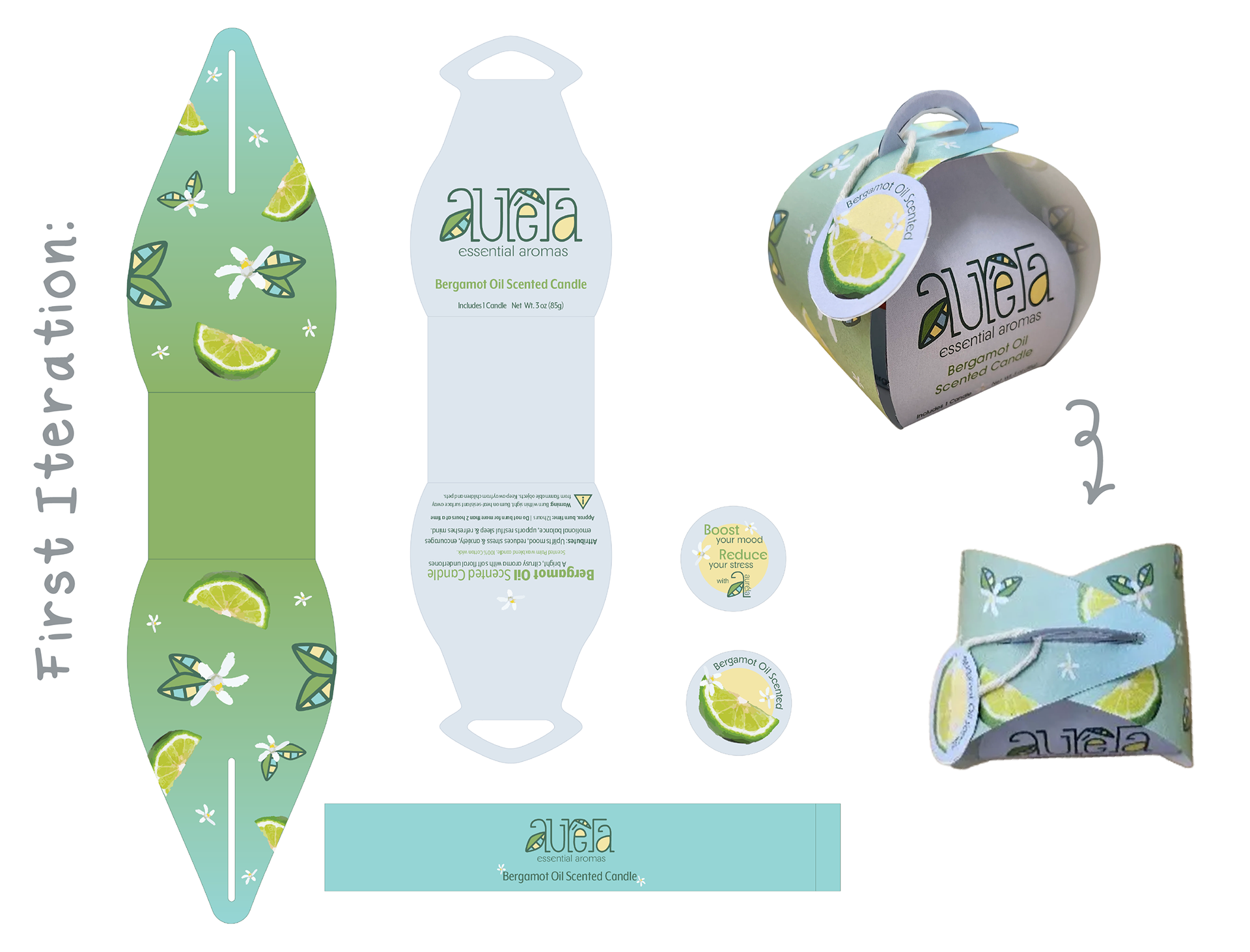
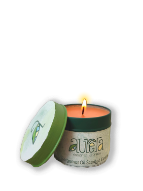
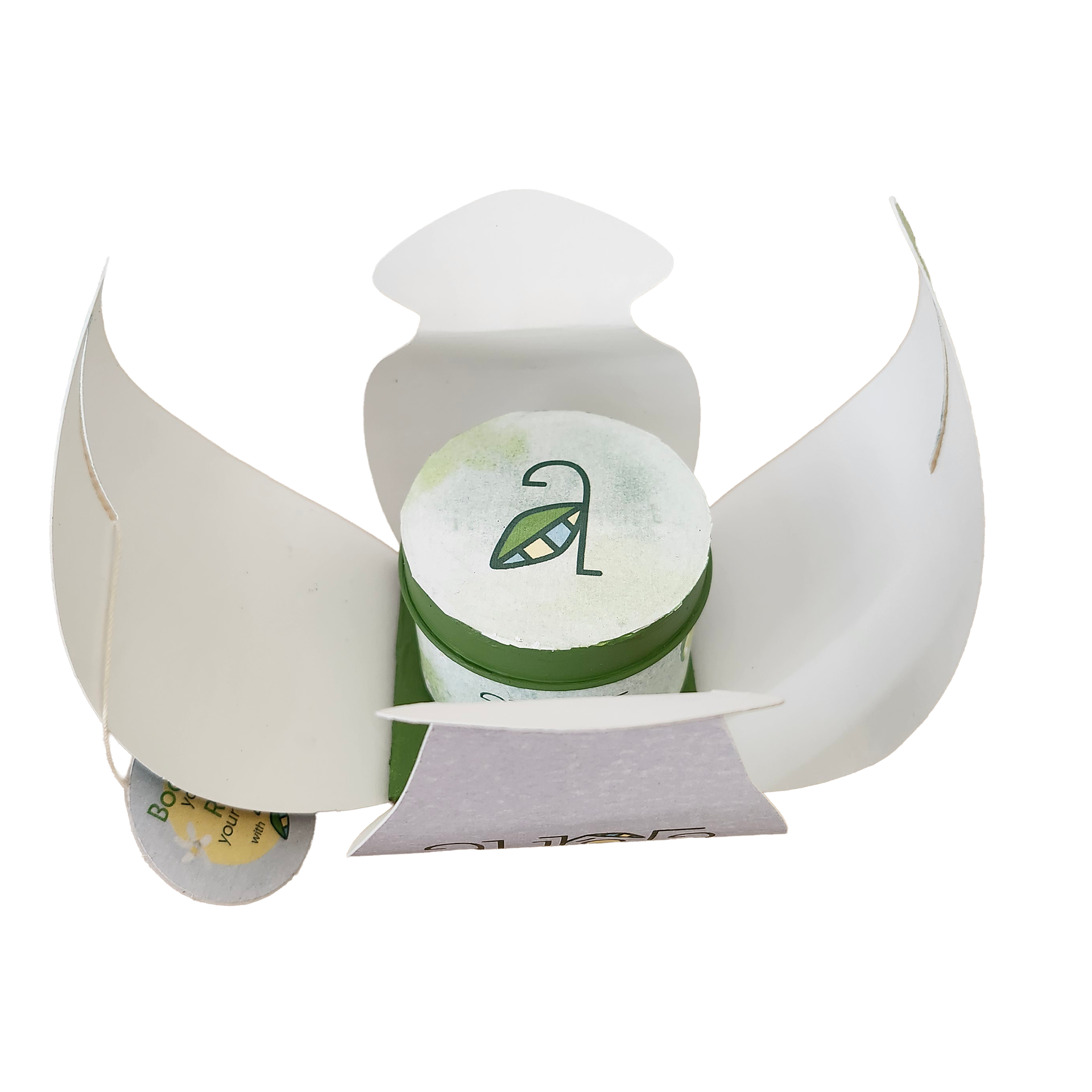
First Iteration: Petal-shaped packaging design that opens up to reveal a candle inside, featuring soft gradients, vector graphics, and ornamental details that enhance and support the overall brand system.
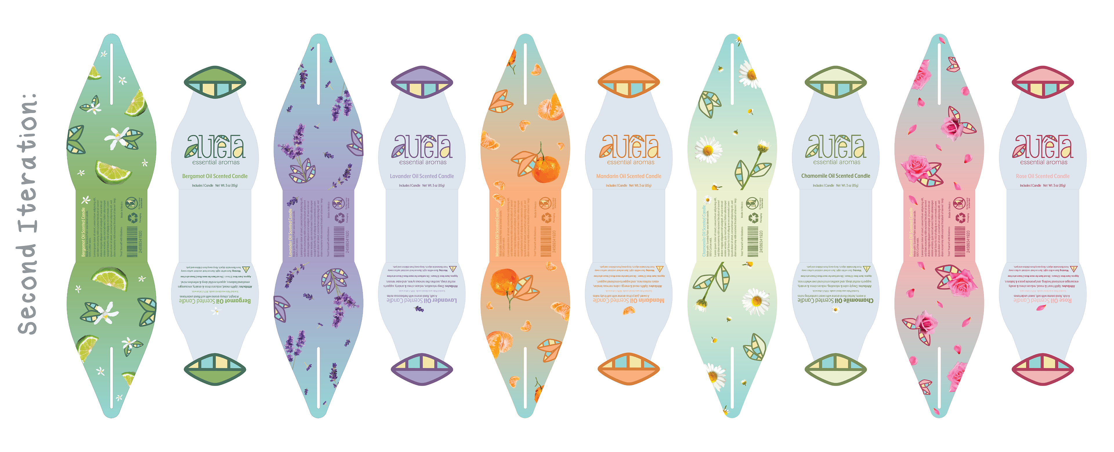
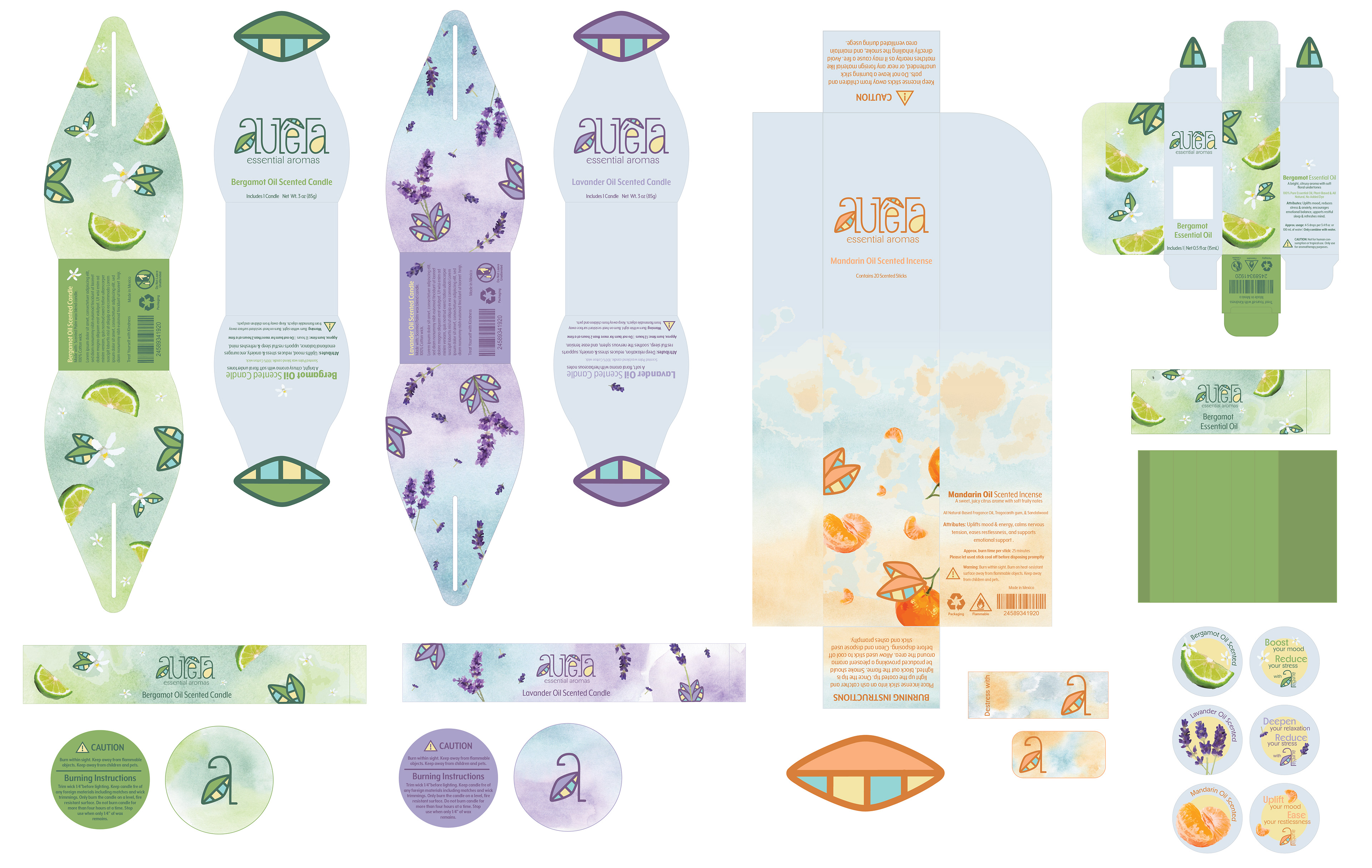
Second Iteration: My main focus was on ensuring that the brand felt cohesive and unified, even as the color palette shifted across different product aromas. I achieved this by maintaining a core visual structure across all packaging with consistent logo placement, typography, layout hierarchy, and overall form. This approach allows for visual variety without fragmentation, giving each product its own personality while keeping it clearly connected to the larger brand family.
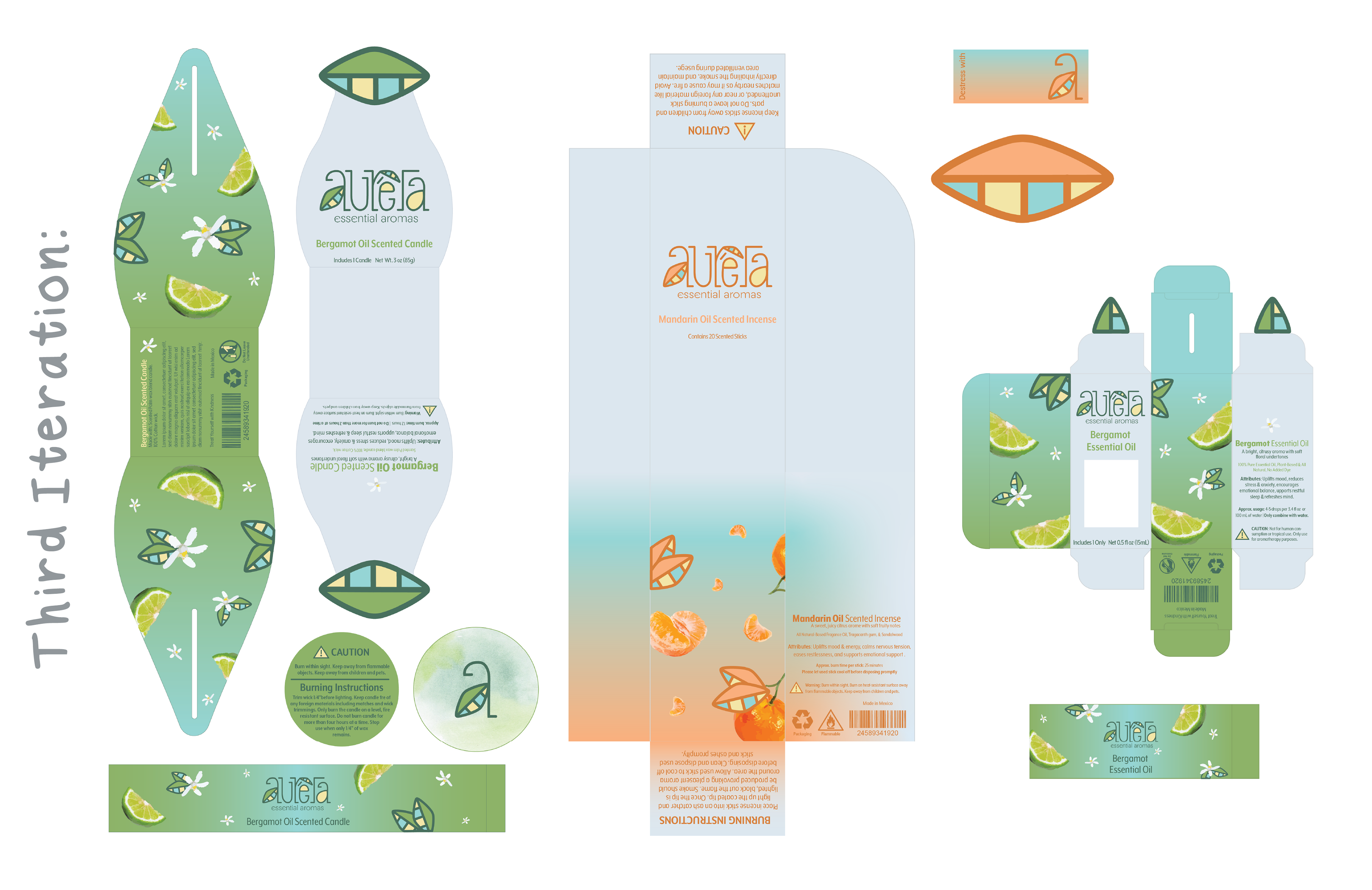
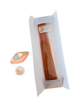
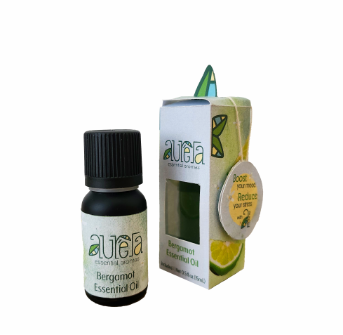
Third Iteration: I made subtle refinements to the candle packaging, adjusting size and proportions to better suit the form and maintain visual balance. I also began developing packaging for the incense and essential oils, carrying over the brand’s gradient backgrounds and pattern motifs to ensure a consistent identity across all product lines.
Adding Textures & Colors
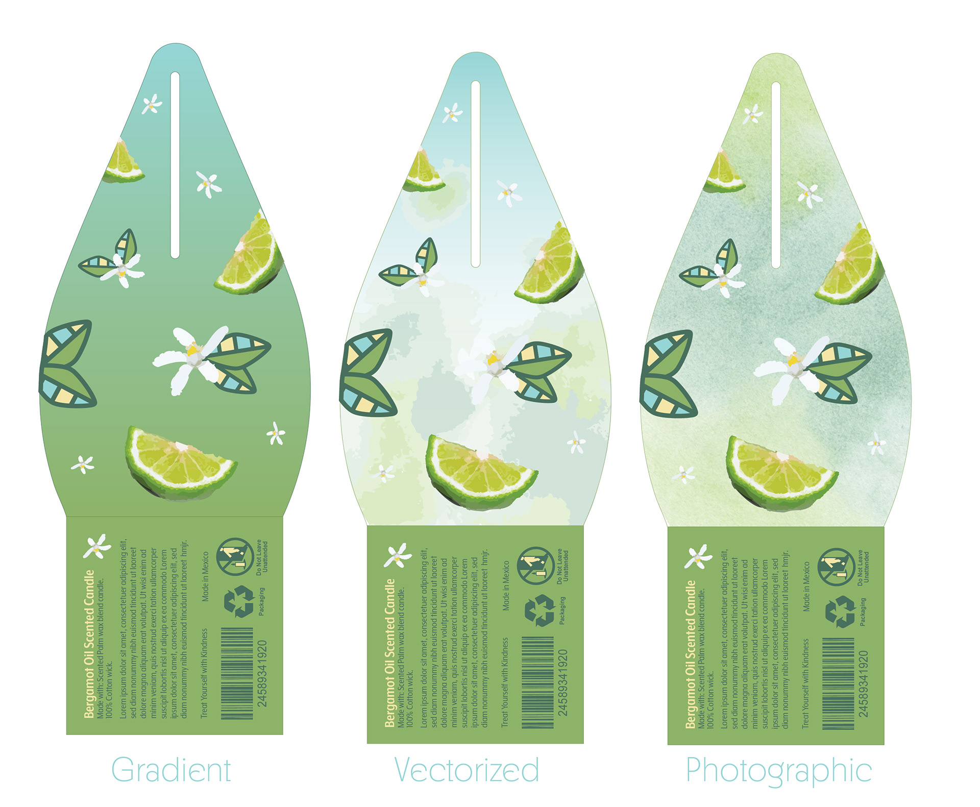
I introduced a hand-painted watercolor gradient for the background in place of a standard digital gradient. This choice adds a soft, organic texture that enhances the brand’s airy, calming aesthetic, while also reinforcing its connection to natural, handcrafted elements.
Reflection
The final brand identity successfully communicates relaxation, mindfulness, and natural healing. Through calming color palettes, thoughtful typography, sustainable packaging, and aroma-specific design elements, the brand creates a clear and recognizable system across all products. The clean, nature-inspired aesthetic resonates with wellness-conscious and
eco-friendly audiences, appealing to both students and professionals who value sustainability, quality, and mindful living.
eco-friendly audiences, appealing to both students and professionals who value sustainability, quality, and mindful living.